Art made FROM RecycliNG…

…materials is something I’ve dabbled in from time to time, and it’s something I greatly admire whenever I see it done by others. Sea creatures woven out of old nets and rope found washed up on the beaches. Horses made from driftwood, beautiful baskets woven from colourful plastic shopping bags. There should be more of it.

I try to include a little bit of recycling in my body of work, I should do more, I intend to do more. I did some today.

I’ve had an old frame (I seem to collect them , from the side of the road or op shops when I see suitable ones, or like when my sister gave me a box from a deceased estate auction she went to), I have a little pile of frames and boards here and a bit of a stack there… …and old books, I collect those too, for recycling/repurposing.

I can’t remember where I got the old frame from that I used today, but I love it. It reminds me of those gorgeous ornate frames in the art gallery. I adore those. I don’t frame my work usually, but I love those ornate gold frames. Sometimes it’s the frames, not the painting, in the galleries that makes my jaw drop.

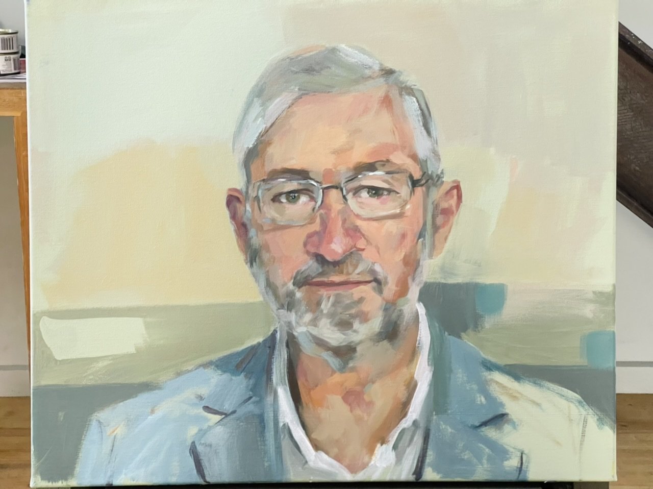
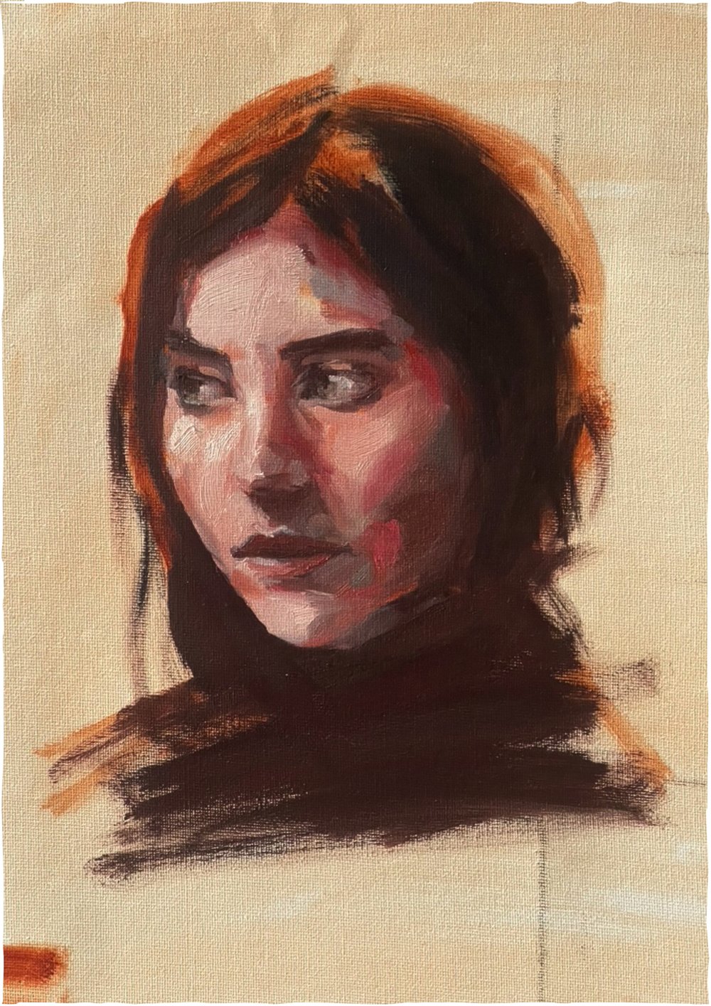
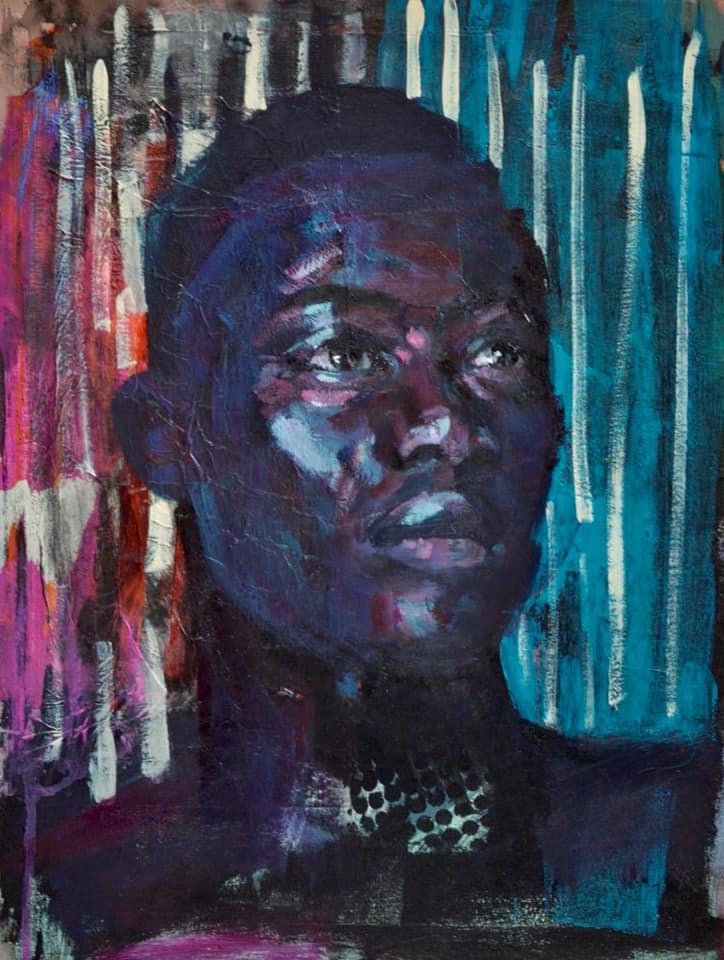
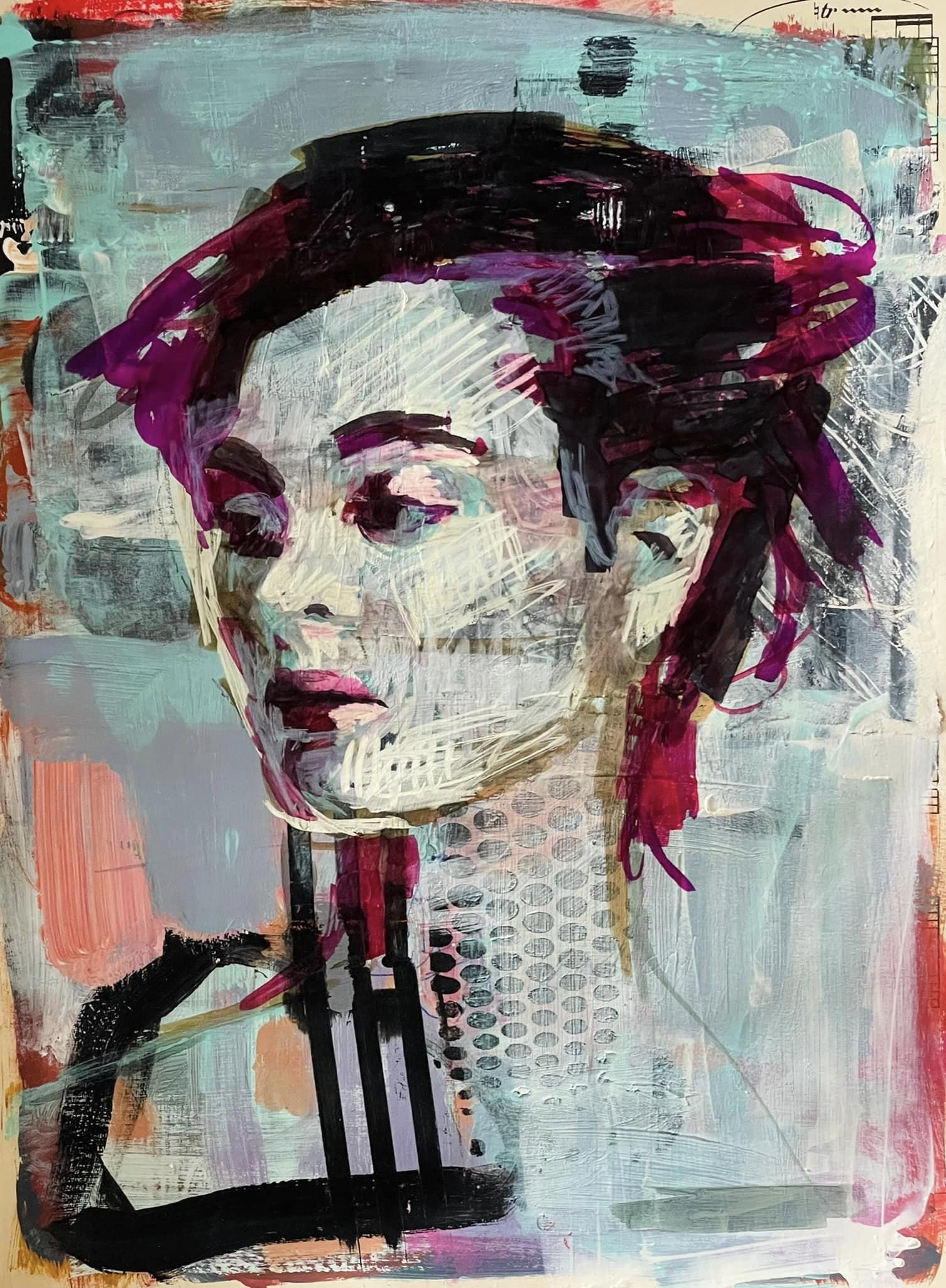
At first I thought to mount a painting in it. I’ve got some completed work on loose canvas sheets in my art drawers, but when I pulled the frame apart I changed my mind and decided to paint straight onto the board. I like painting on board, and in this case it’s pre-cut to fit the frame perfectly and what I ended up with worked really well, I thought.

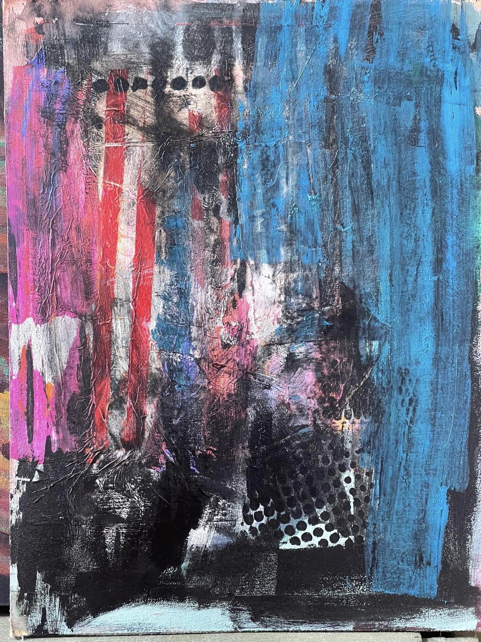
I didn’t have a plan, and it was a few months ago now that I pulled the frame apart - I tried a few different completed paintings on loose canvas sheet in it and I couldn’t decide on one so I started painting an abstract straight onto the board with left over paint…and then it sat there for a while with a weird abstract start.

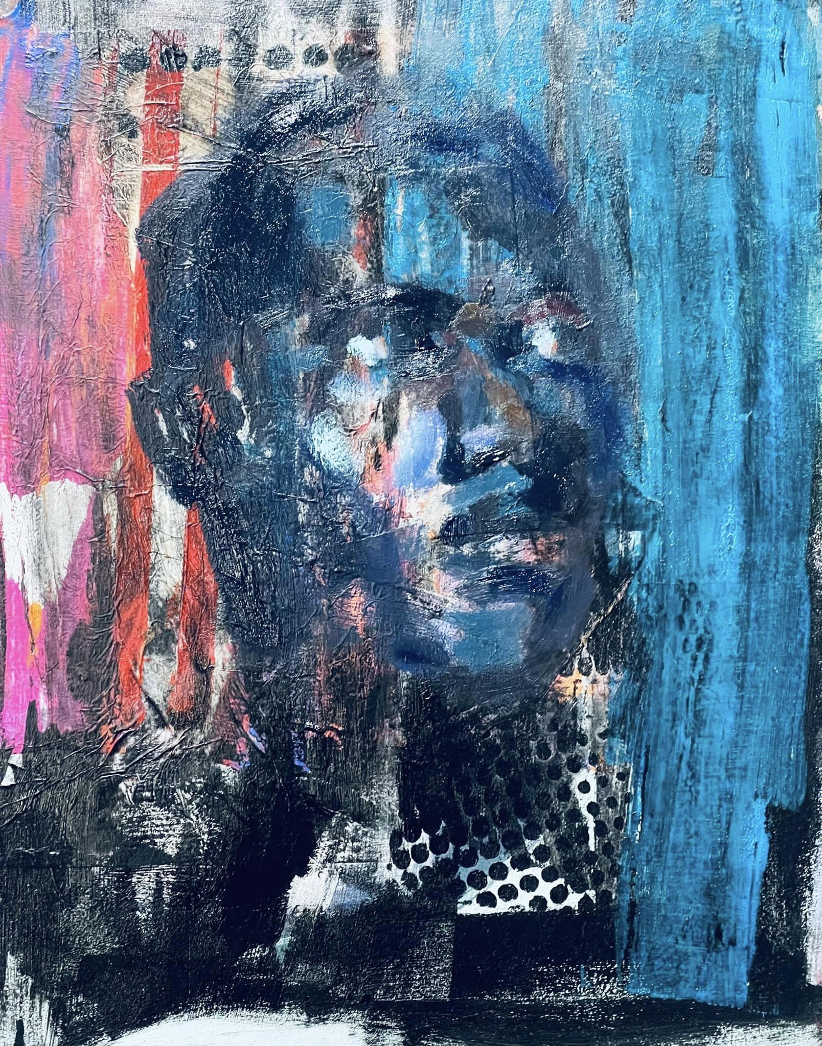
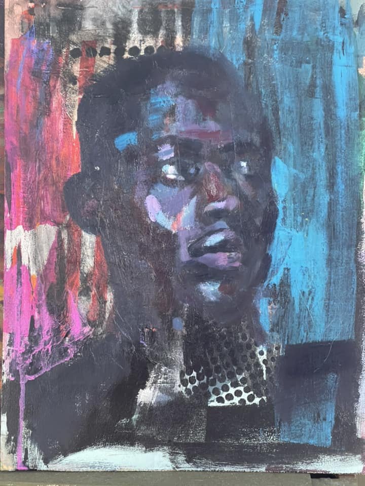
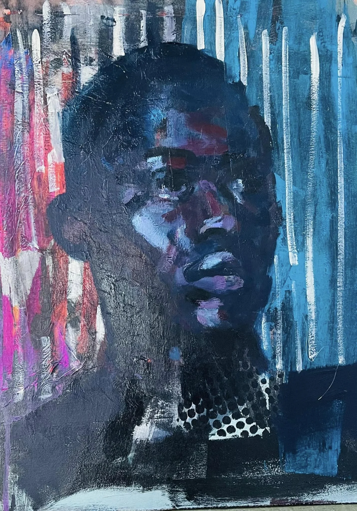
Then, a few days ago I had more paint left over so I obliterated my abstract start with it and left that to dry, and then the next day I had more paint left over and that’s when I decided to paint the portrait I ended up fixing in the frame.
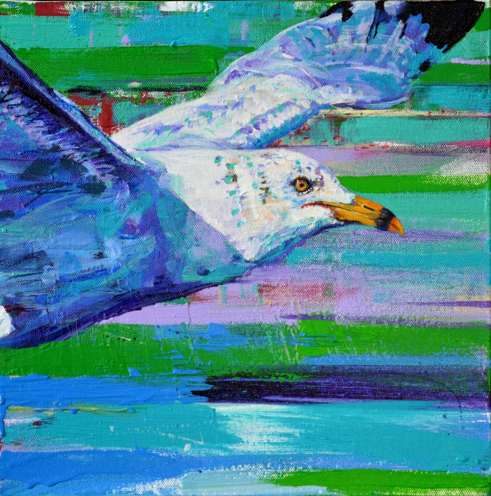
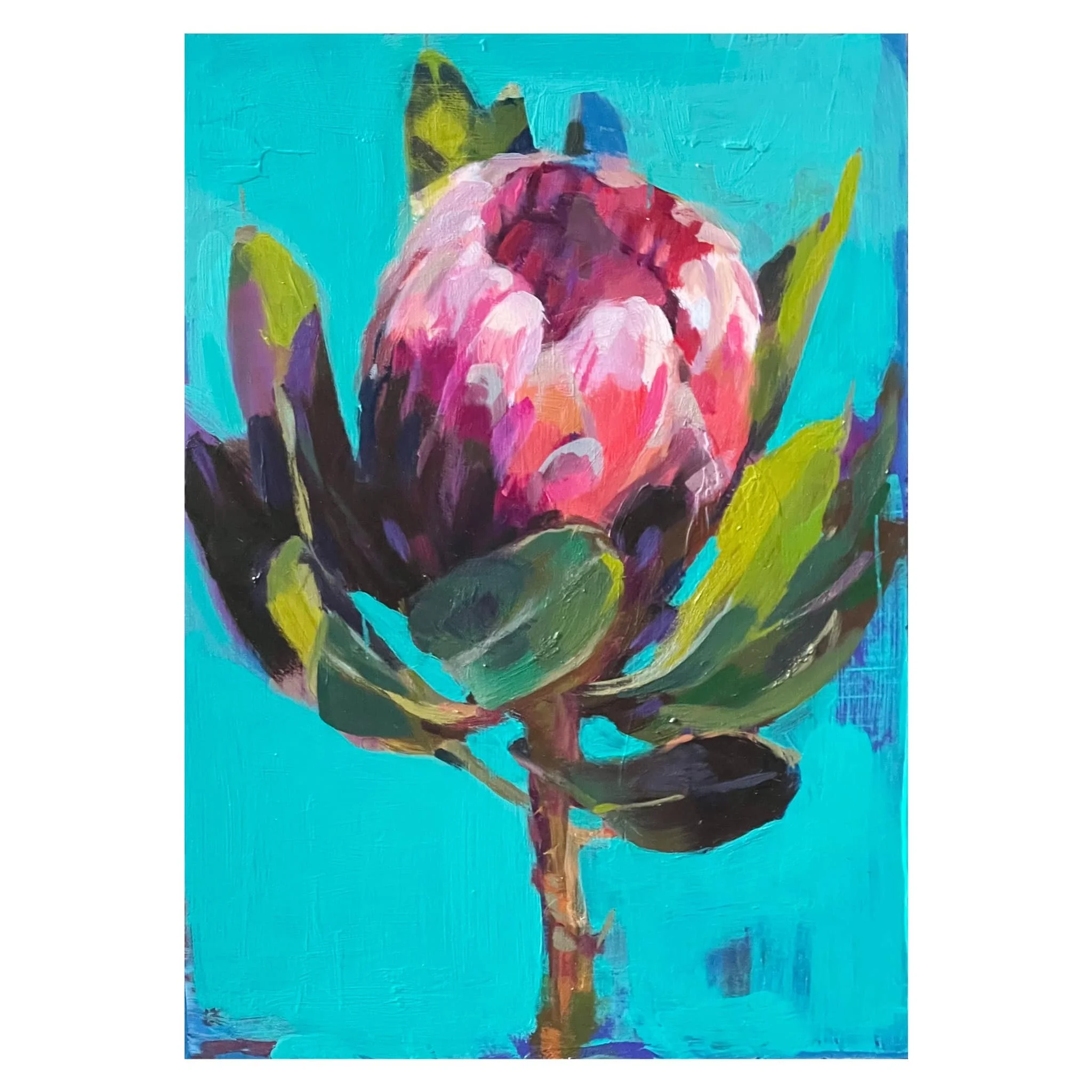
check the progress:

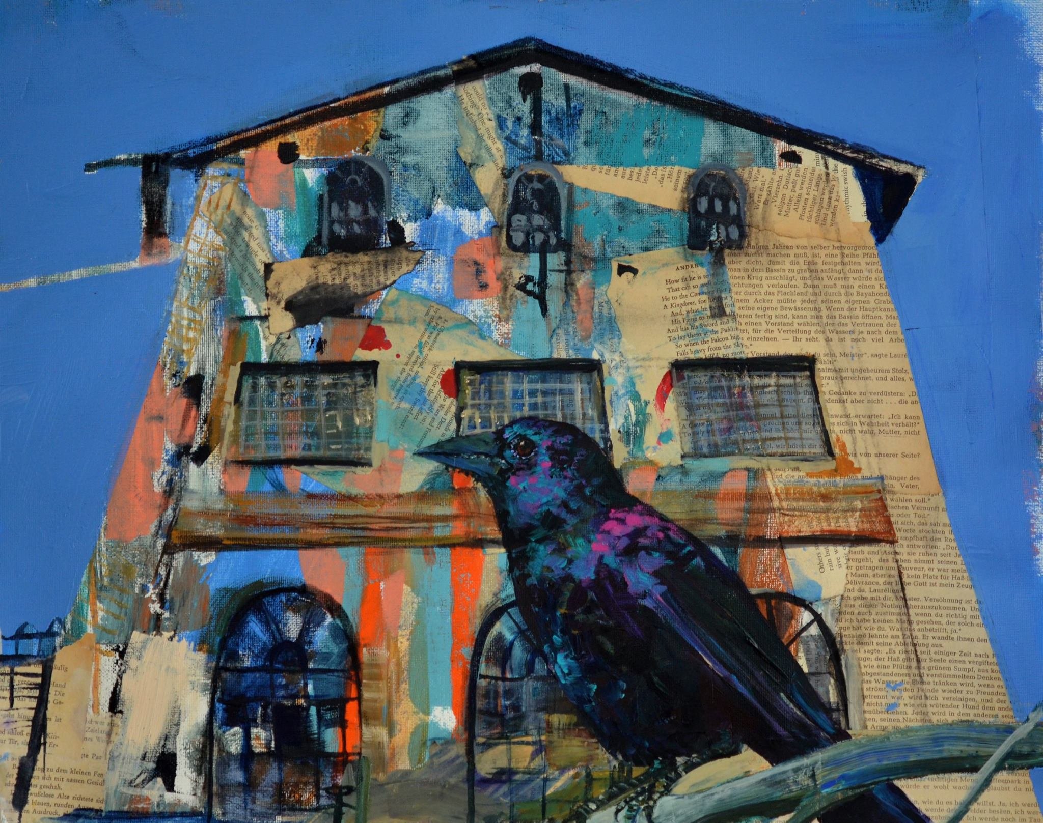
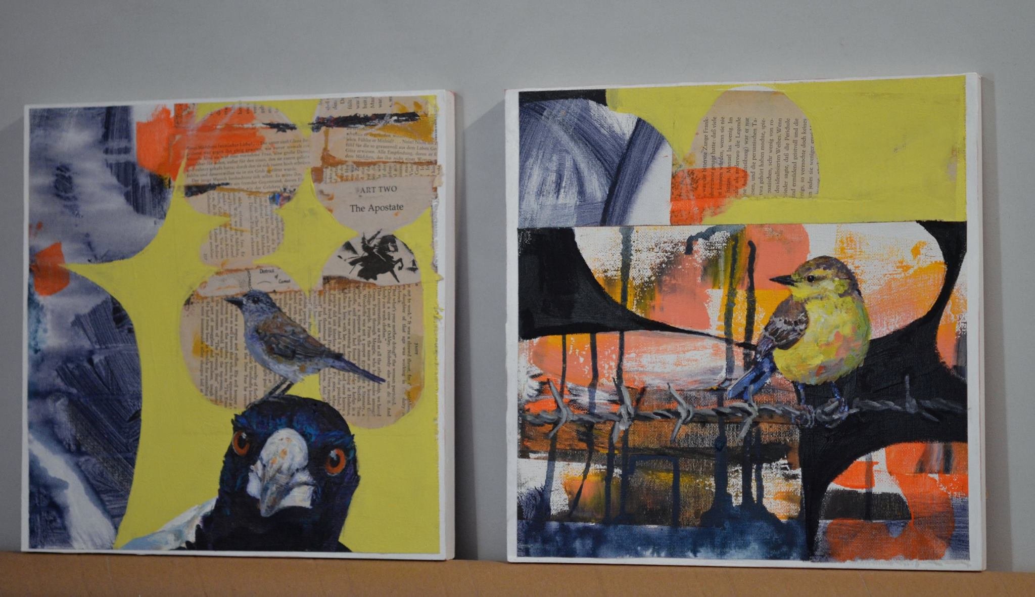
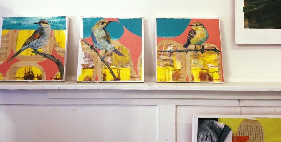
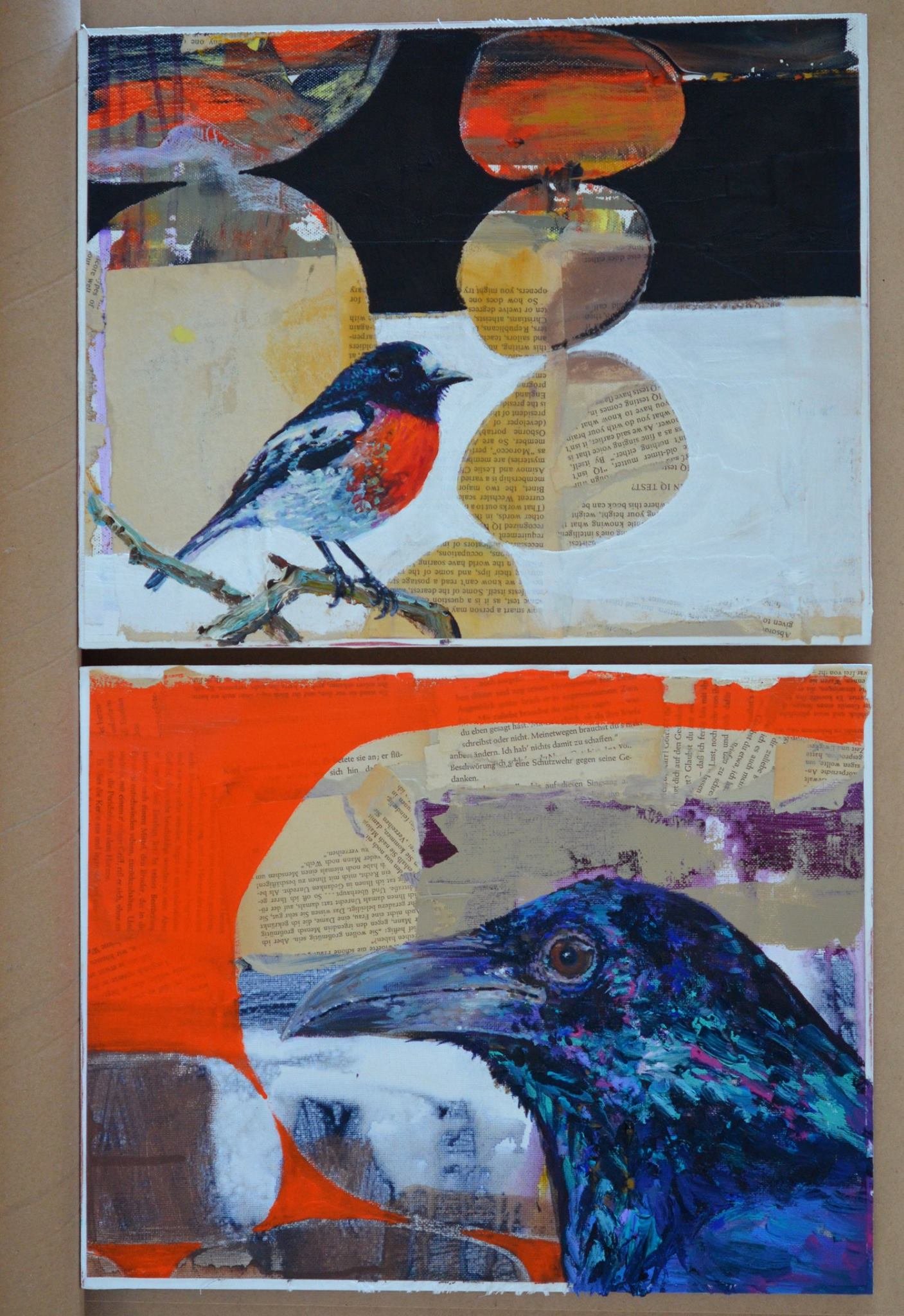
Another thing I like repurposing is books. I’ve used them in collage creations:

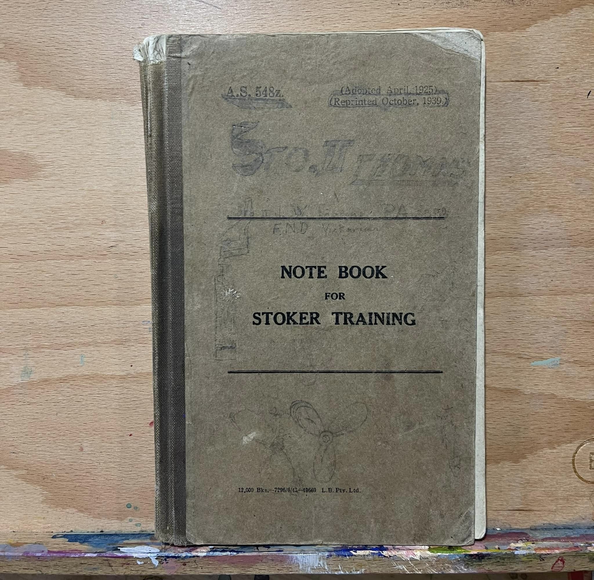
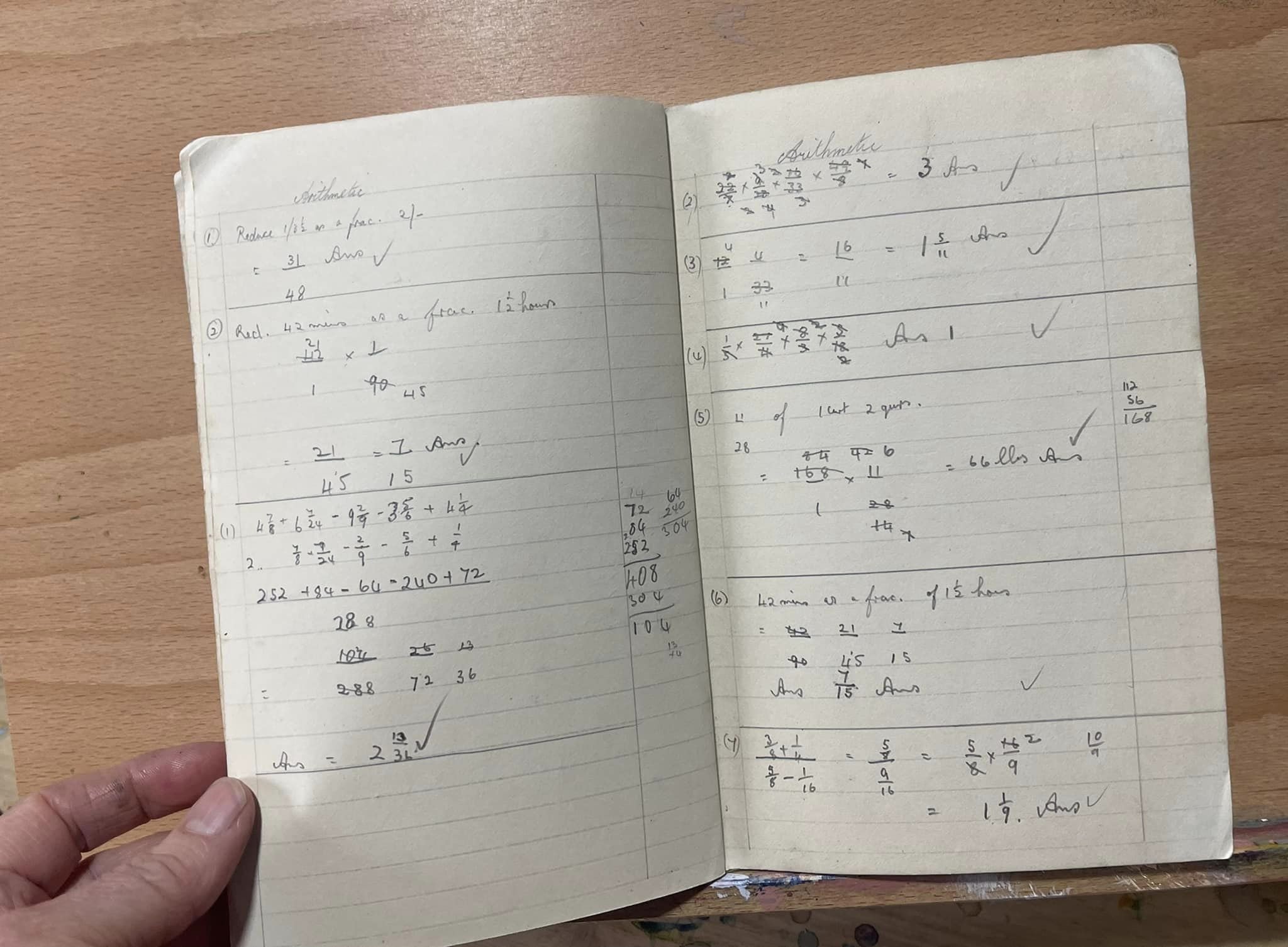
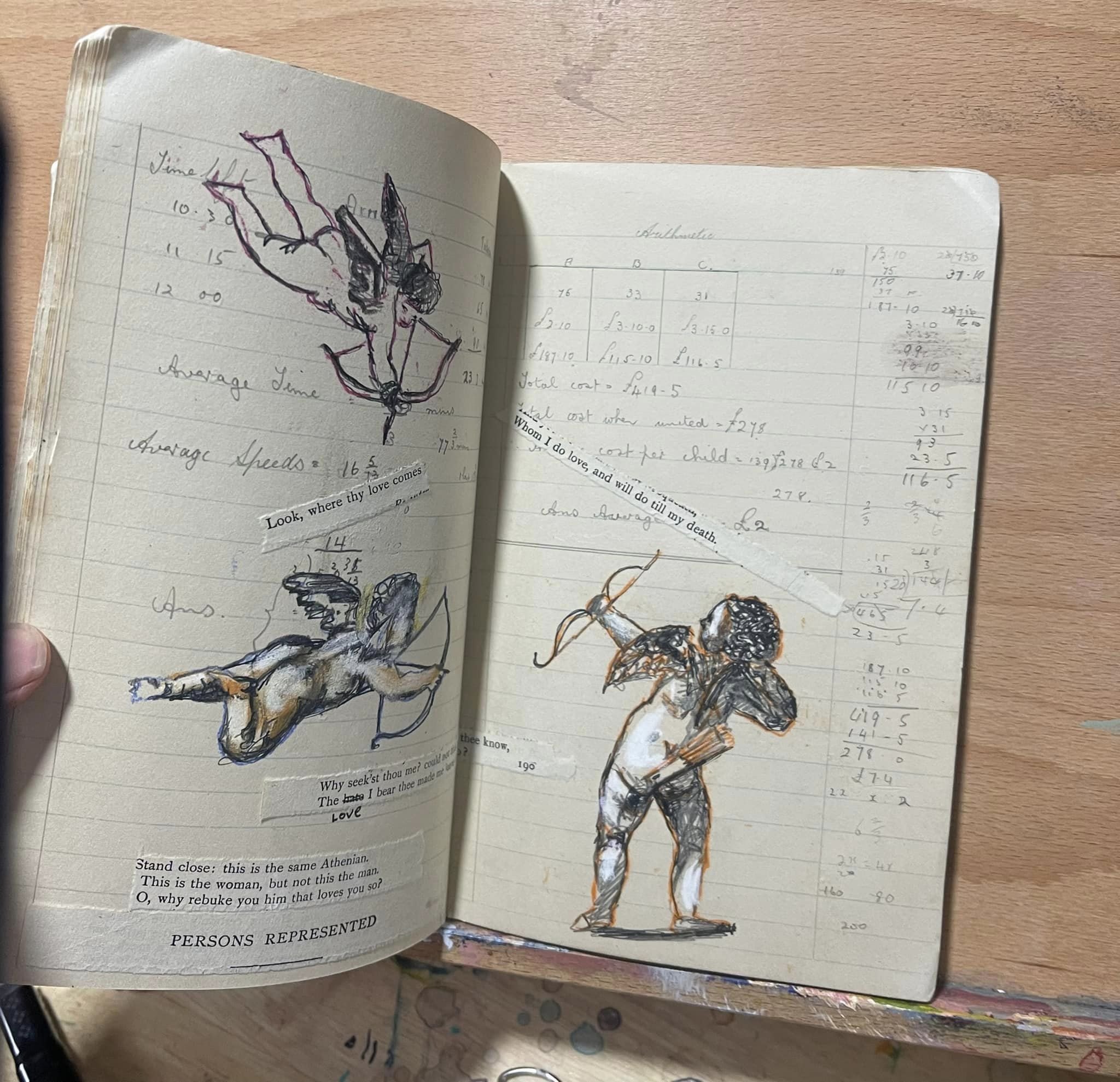
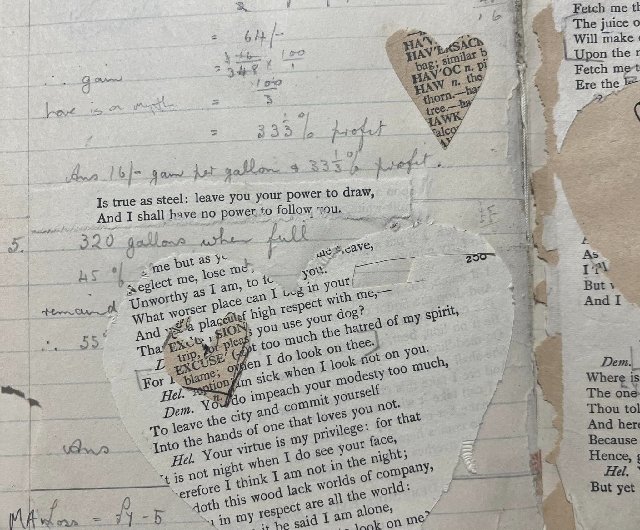
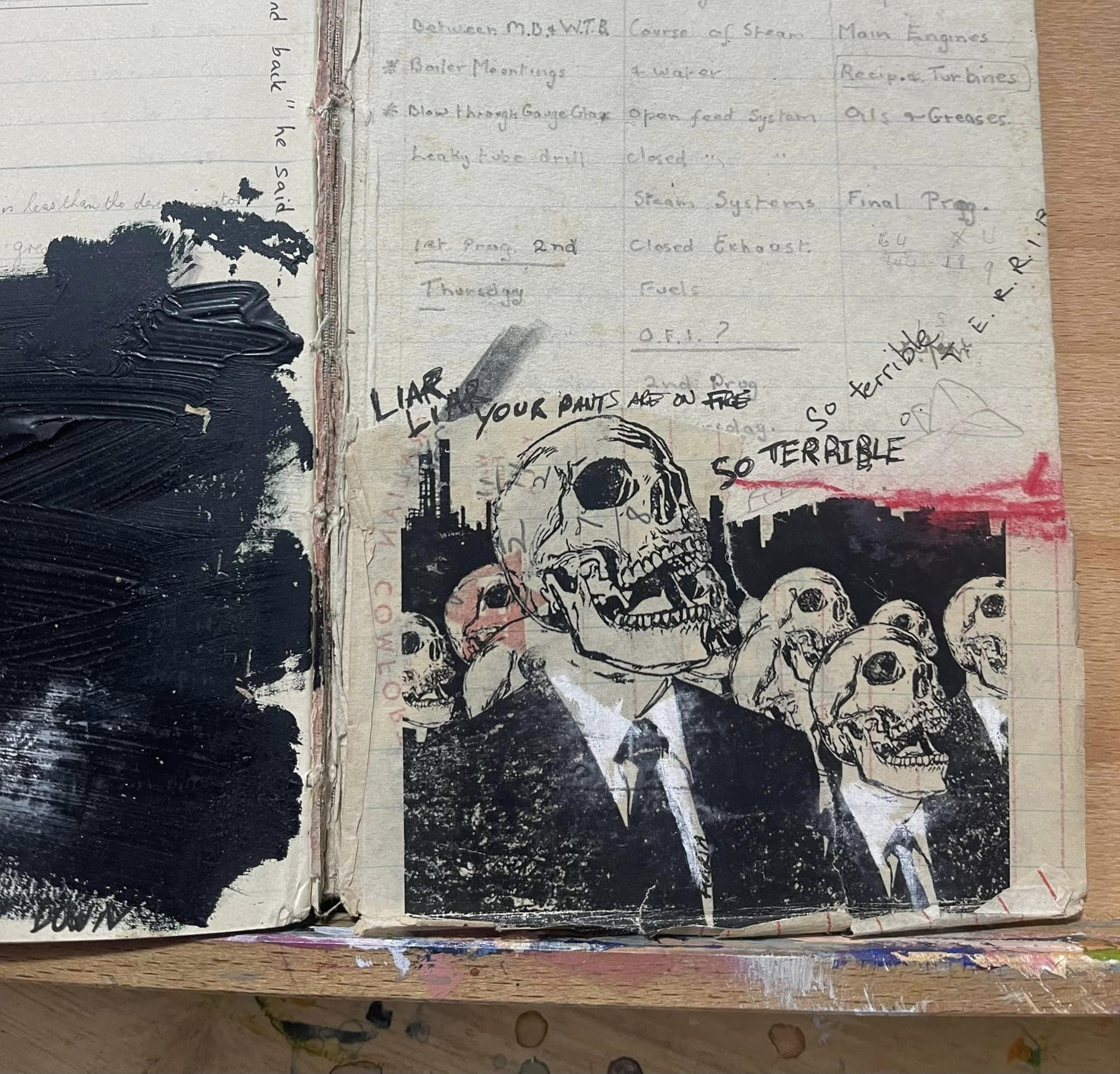
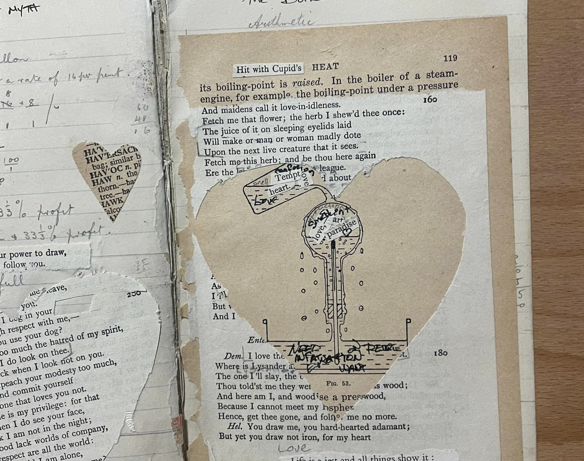
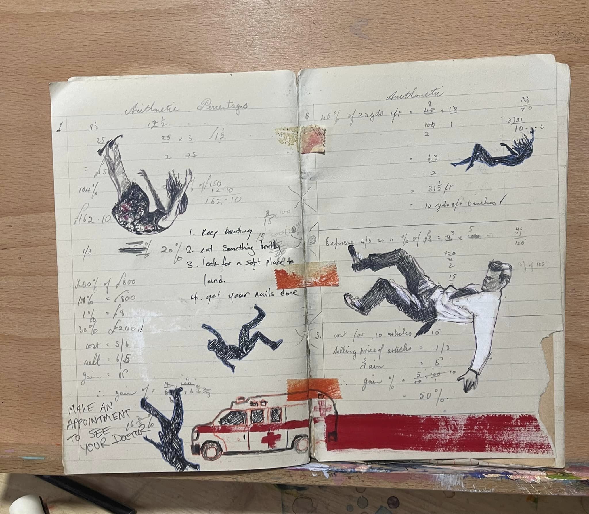
and I also love keeping them as books and re-writing them entirely, like this vintage stokers note book that has hand written notes and mathematical figuring out stuff in it. I repurposed it into Cupid’s little Black book that I work in when I’m feeling particularly poetic.

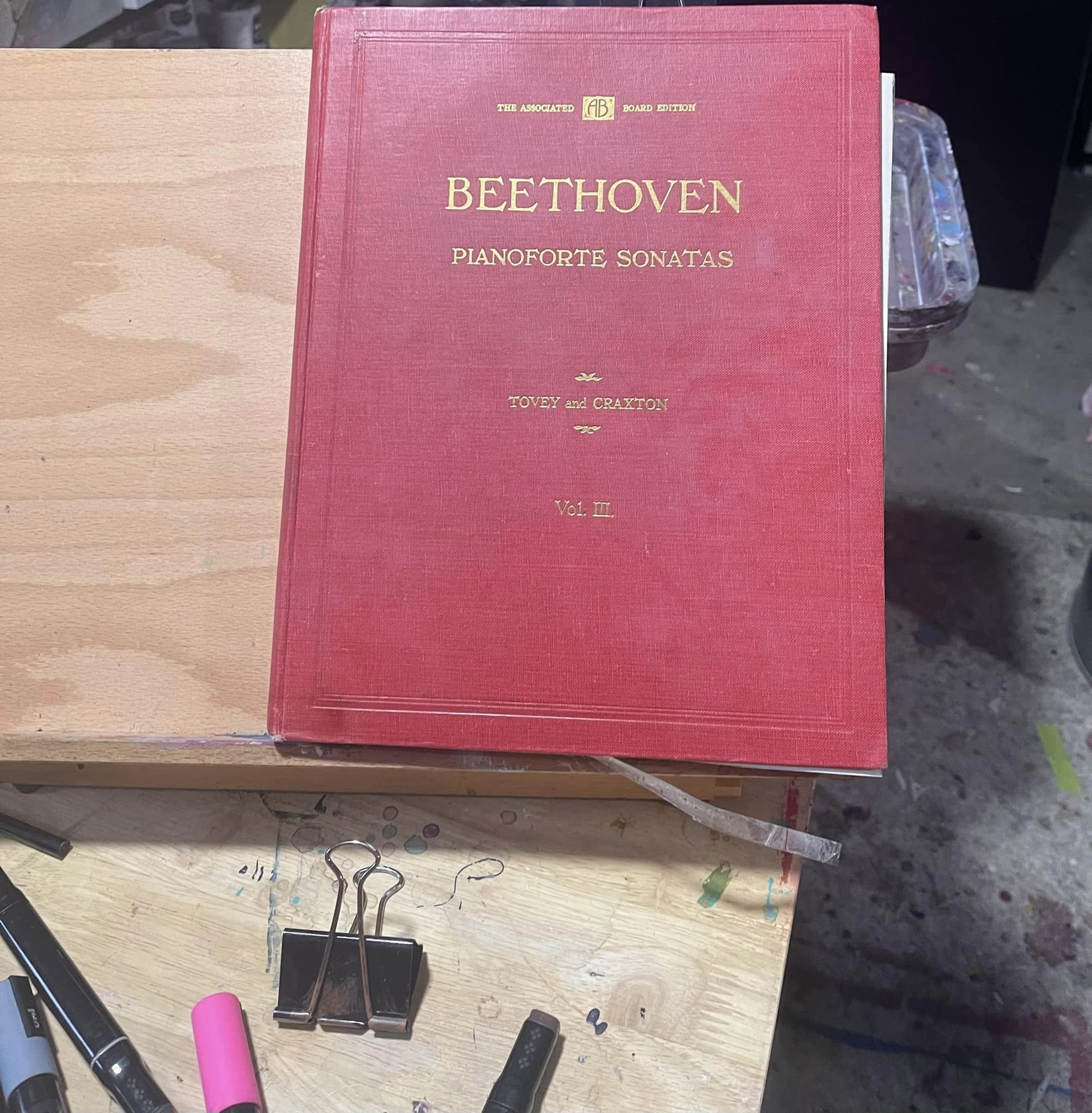
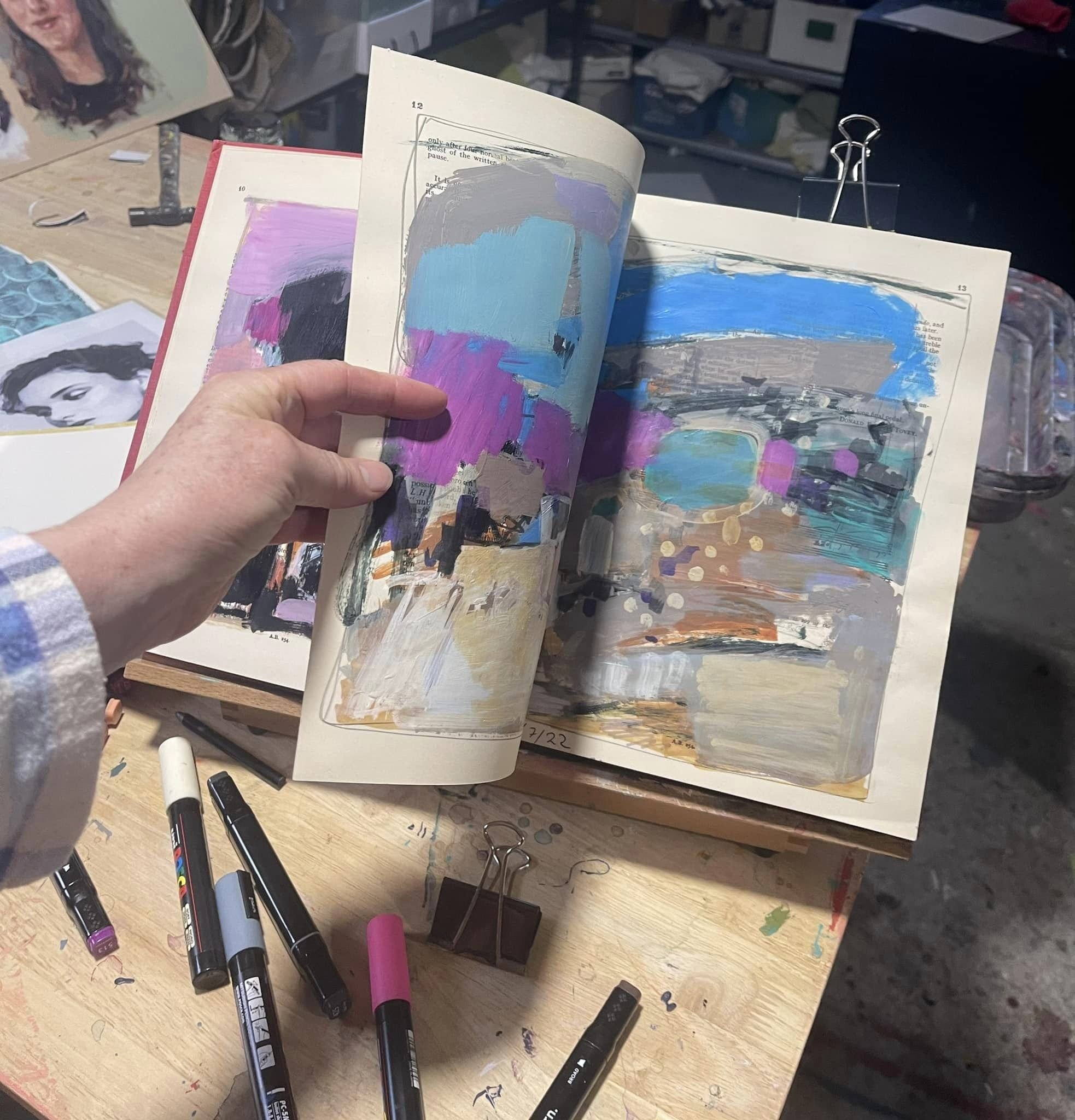
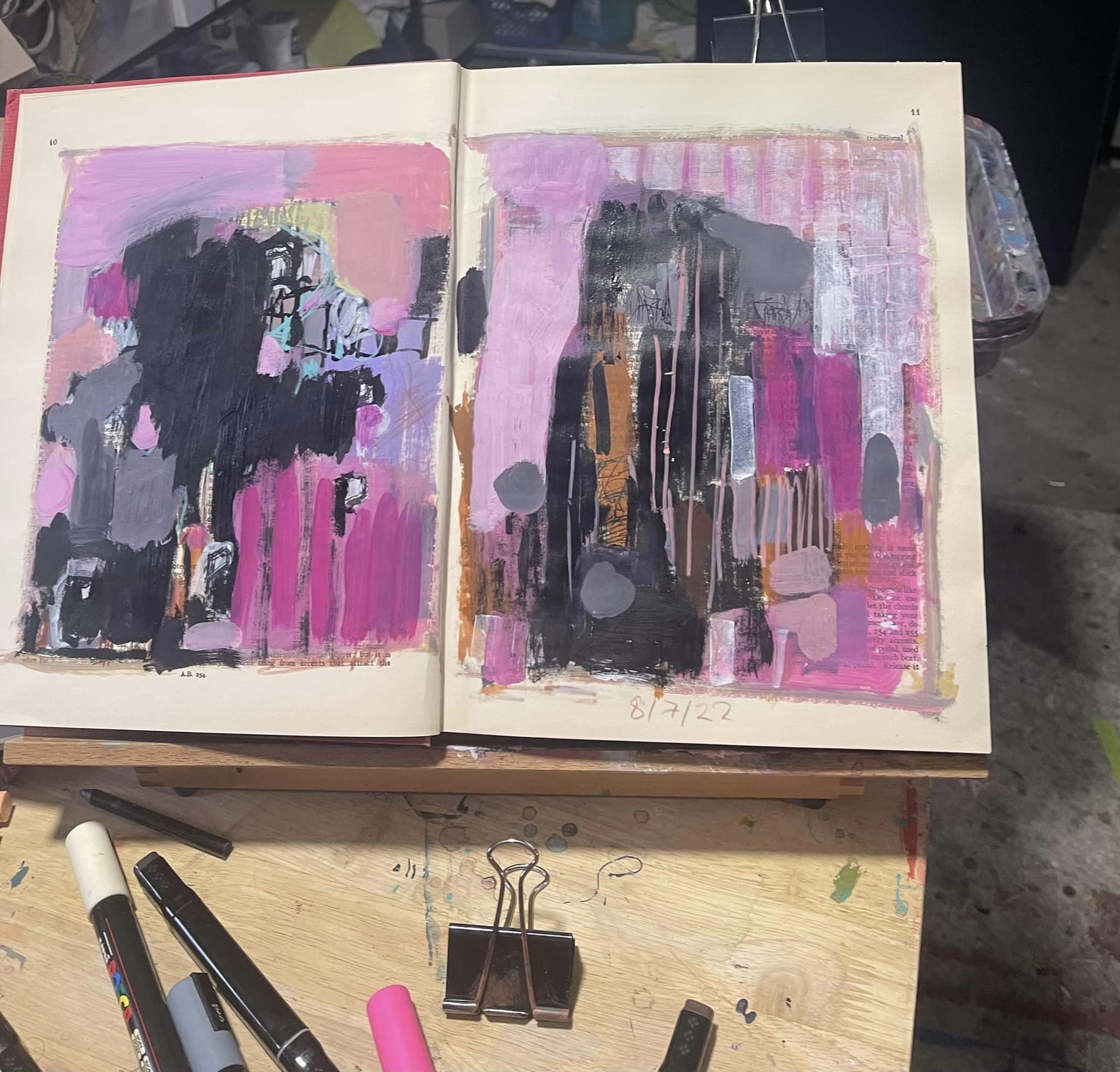
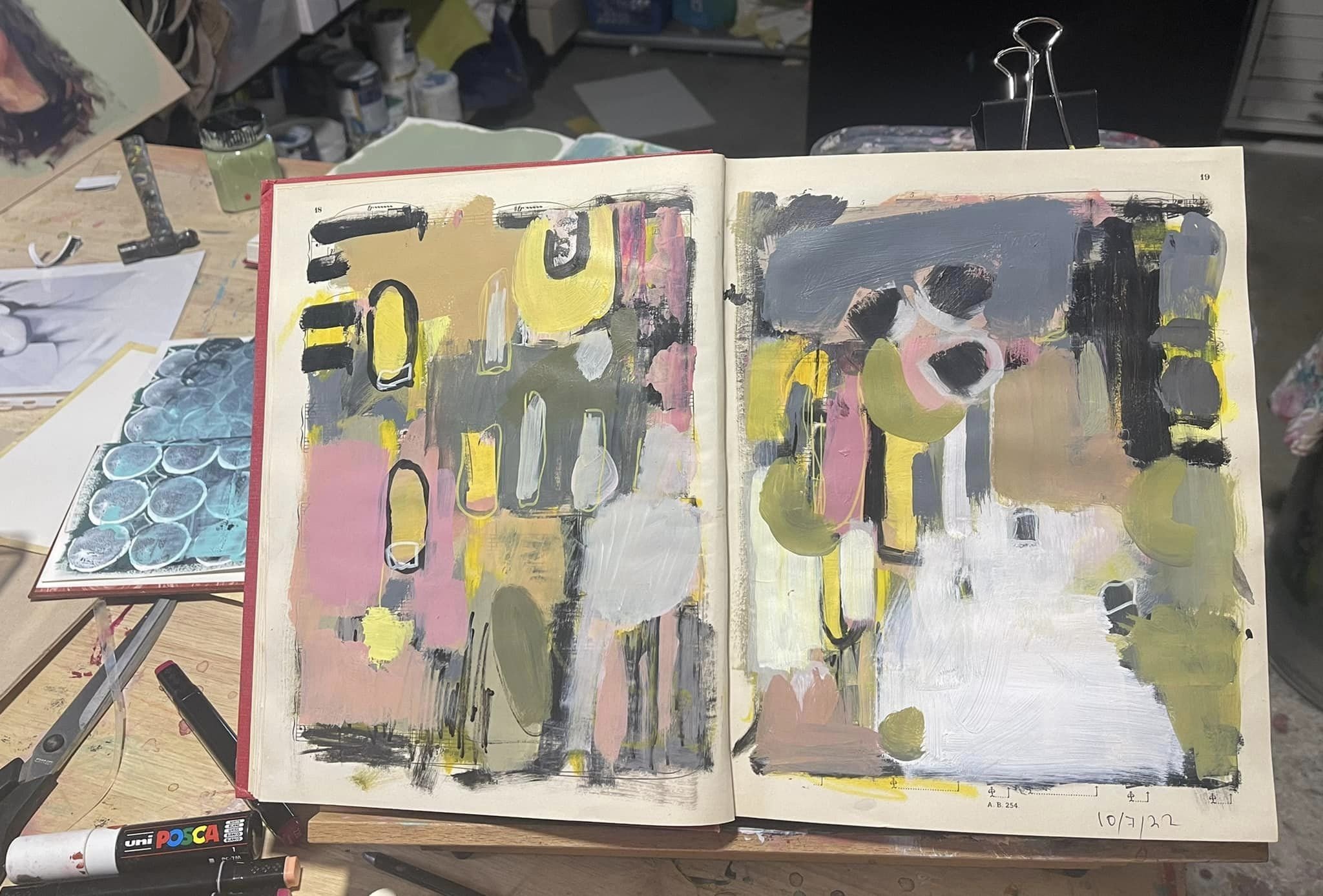
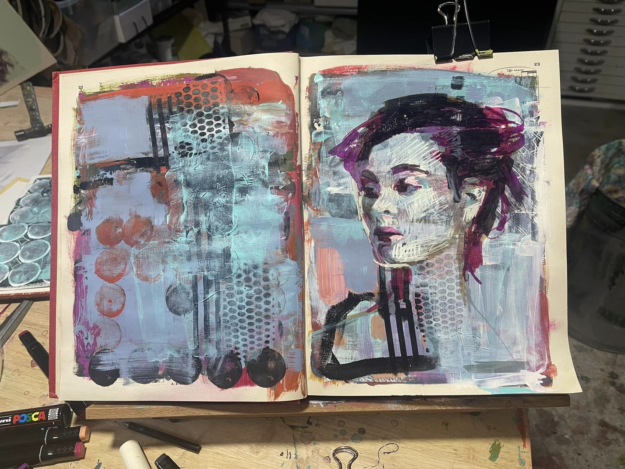
My latest book endeavour is a 1931 Beethoven’s sonata music book, gorgeous with a hard cover and the pages are silky smooth and surprisingly tough and wrinkle resistant when paint is plastered over them. This has become my expressive abstract enquiry book, and I work in it when I’m feeling particularly rebellious.

So I’m hoping this inspires you to do some repurposing stuff into art, so some of that stuff that is just lying around with no purpose and destined for landfill will have a purpose again.

Live portrait painting…

…in the public space is a very different experience than in a studio or painting from a photograph . A good studio setting can have fixed, flattering or dramatic lighting, and the light on the sitter doesn’t change. In a public space with daylight around the light constantly changes, is weak or strong or both if it’s a partly cloudy day, so it doesn’t matter how still the sitter sits because when the light shifts so do the shadows and highlights on the face causing everything to literally move - things look different depending on how the light hits it and because of this you’ve gotta paint fast.

The man who sat for me, Geoff, was excellent at sitting still. You can’t really talk while sitting still because everything moves when you talk which is something you just don’t notice untill you are painting someone or having to sit still. He had his own set of challenges in sitting still. He found a spot across the room to focus on and people kept walking in front of it trying to catch his eye. It wasn’t a warm day either and the chair wasn’t that comfortable and I kept interrupting him with questions.

My day began early, I had to be at the show by 10am and I planned to get there early to set up. There would be provisions to hang some work at the back of the stall we were allocated - two artists working each day in this stall right at the entrance of the Taste SA pavilion.

Painting outside of your own studio requires planning. What to take? Oils or acrylic paint? Canvas size? Will there be water to wash my gear? easel? (provided thank goodness!!) I’ll need to take my own water…How will I get there (train - they offered car parking with shuttle buss but that seemed harder than train)… could I manage a wet oil painting on a crowded train? No… The question really is “what can I manage to take and then bring home on chosen transport”. The weather forecast predicted rain.

Lucky for me I have this hardcore Mileaukee toolbox which is pretty sturdy so I carefully packed it with the minimum - paint, brushes, wet pallet, water for washing brushes, rags, a drink and snack, a sketchbook, some flyers, my tickets and food voucher and then onto that I strapped my canvas and some other suitable paintings to hang up in the stall which needed to be wrapped in plastic because of predicted rain.

When the train pulled up I noticed a big gap between the platform and the train. My gear being too heavy for me to lift I had a little panic - “oh how will get this on…?” As I stepped on backwards ready to heave it up in some kind of clean and jerk manoeuvre a nice young man in school uniform asked me if I “wanted help”?

“Yes please, Thankyou so much I really appreciate it.” He hoisted it up from the bottom handles while I pulled from the top and there I was on the train - now…something about a ticket and ticket machine…

Getting off was easier - I followed closely a family with kids as they made way to the exit through the crowd - there wasn’t a gap between door and platform either, because this Showgrounds platform was newly re-built, so it fitted the new electric trains perfectly.

Having been given an Exhibitors pass I went straight in before the gates even opened at 9am.

Making my way past the empty carnival part I thought this would be a good blog story so I took a pic 😊

After setting up I went for a bit of a wander to get my bearings.

Ready to start painting at 10am.

I asked Geoff a few questions before I started. I explained some of the ways I could compose this painting, took a few photos and cropped them to show him a few different compositions - like how much of him I could paint to fill the canvas and how much space for background I could have, and we agreed on the composition before I started.

We stopped for lunch after two hours of painting to resume again at 2pm.

Because I was going to finish this painting at home, I took some photos of Geoff where he was sitting that i could use as a reference to finish it at home, and after lunch I started working from the photo on my phone which helped me make some corrections, settle on an expression and better see some detail. After a further hour and a half Geoff had an early minute and I chatted to some people, and a friend who popped in and took a few more pics for me. Thanks Kathy 😊

I’ve got a few more hours to do at home but in my own space it’ll be a bit less stressful 😎

Photographing Paintings…

…is necessary when you intend to show them on social media. Posting your work on social media not only shows them to people, it’s also a great way to keep a record of your work. To archive it.

Facebook is particularly good for archiving work because you can create folders of paintings, put collections together in the folders and name them, and everything is dated. It’s then easy to search for a particular folder when you’re looking for something, and if you happen to be out and about and want to find a particular work, you don’t need your computer or hard drive, ,or to have alot of space filled with photos on your phone, but simply access to the internet on your own or someone else’s phone, go to photos on your site and find the folder which is listed under photos on your page.

It’s not hard to get a good enough photograph of your artwork for the purpose of posting on social media. You don’t need or want a large file format (like one that’s good enough to make a quality print) for social media because the sites down size them anyway. So unless you’re posting on a print-on-demand site like RedBubble, or sending an image that requires a 2+MB file for whatever reason, any ‘ol smartphone will take a great photo for this purpose with a few little tricks and tweaks.

The first and most important thing to do is turn off the flash. the flash will obliterate detail, and with the light bouncing off of the surface, completely change what the painting looks like.

Light is very important and the only light that works apart from very expensive studio lighting is daylight. Filtered daylight. So in the light of day but away from direct sunlight, that can be inside with the room lit up by windows allowing as much daylight in as possible, or on the shady side of the house outside, or under a verandah, etc. Cloudy days are my favourite.


I did a study last night to test a pallet I might use for my live painting at the Royal Adelaide show next week, so I thought I would compare the artificial light from a photo I took last night to the natural daylight from this morning.

above is the difference between daylight and regular artificial light that we use to light our homes - no filters or adjusting was used in these photos taken with my phone.

There’s a spot in our home that has light coming in from all directions including above, and that’s where I keep my “tidy easel” for photographing my work. If the sun is streaming in from one direction, nice and brightly, I turn my easel away from it to take the photo. If it’s a dim and dark cloudy morning or evening I turn my easel towards it. I’m avoiding shine which obscures detail and avoiding a kind of light that picks up too much detail on the surface like a speck of dust - the focus needs to go beyond the dust on the surface so a tiny tweak of a turn away from the light achieves this.

Set your phone/camera to its highest resolution. “Super Fine” or HD, high definition, or large, however it reads choose the largest setting (one that takes up the most memory space for a quality photograph. (Not live though).

Get as close to the painting as you can and square it up - so all sides of the painting sit as equally in the frame as possible. If the bottom edge of the painting is narrower than the top it’s not square.

an example of a squarely lined up and a not squarely lined up painting.

cropping

Once you have a good photograph it’s easy to crop on your phone with the editing setting, or you can crop as you upload to social media with whatever platform you’re using’s photo editing options. They all have them.


then of course you can style a scene, or take photos of your work to show them hanging - here you can be a bit more creative.

using the candy mock up app which allows me to upload photos of my art into a styled scene

Do The Minimum...

…is something I say alot when I’m talking about my own painting philosophy.

What do I mean by “do the minimum”?

As always when it comes to articulating a concept in art there’s more to it than first meets the eye - I realise that I need to organise my jumbled thoughts into some kind of coherency that I can use to describe in words what I mean.

Words are hard!

I admire those that write well and speak just as well.

Enough with the apologetics and on to the explanation!..

“Do the minimum” doesn’t mean to skimp and not be generous in whatever work I am doing at the time or with the materials I am using. So it doesn’t mean paint sparingly, like put on a little bit of paint and make that go a long way by spreading it thinly over the area with lots of stretching the paint with vigorous brush work. No elbow grease required. Perhaps that could work for a minimalist approach, but here you’re putting in a lot of effort to make a lot of effort look sublime and simple, yet deep and rich and interesting. Minimalistic is the opposite of “do the minimum”.

On the contrary, “do the minimum” means put out a lot of paint and in 1 deft movement apply that paint to wherever it is going, and to do that bit effortlessly. I do have to put effort into solving things (like colour, tone, paint consistency) on the pallet first, I need to know what’s on my brush at the time I load it with paint and have some idea roughly of what it’s going to do when I offload it onto the painting, but not worry about it not doing exactly what I expect it to do when I lay down the paint (there’s always going to be some unexpected deviation from my expectations), and then stopping when it’s done just enough to vaguely express what I was hoping it would, or stopping sooner if it looks completely wrong from the get go. Once that paint mark is down I must let that paint mark sit there as I move onto the next paint mark, I can afford to tweak it gently once or twice, perhaps with another brush or my finger or a rag, but then I must move along to working on the next mark first on my pallet loading the paint onto my brush as closely to what I want to achieve with the next brush mark as possible, then offloading that paint onto my painting with as little effort as possible. Then, with as minimal corrections as possible tweak the mark and accept it for what it is - good or bad, right or wrong I can come back to it later and correct it with a new mark of paint. Later…when it’s dry and the whole painting is full of these kinds of paint marks the chances are that it’ll look better and make more sense with the addition of other paint marks that have been laid down next to it.

Every thing looks different when surrounded by different things. Like a tall person looks tall when surrounded by short people, but not so tall when everyone is tall. Red looks more red when it’s sitting next to green, but less red when it’s sitting next to a brown-red colour, or next to purple. A field of yellow sour sops look pretty from a distance, but not so great when one or two pop up between the paving along with a thistle and some stinging nettle and pigeon poop that’s been blackened with whatever berries they’ve been eating that day.

“Do the minimum” is about minimum time spent applying paint and maximum time spend preparing for that application.

Do the Minimum

is about minimum time spent applying paint and maximum time spent preparing for that application.

It’s about being economical with my brushwork, and how this can be achieved is by being generous with my time spent solving problems on my pallet and sometimes in my sketchbook.

It’s some kind of ironic paradox, or is it an oxymoron, that I spend a lot of time working out how to do the minimum and then practicing doing the minimum so that I can do the minimum.


Lilies and lavender from the garden…note: this philosophy doesn’t seem to work on my garden…

Naming work...

is part of the process of completing and archiving my paintings. I name all of my finished paintings and write the name on the back of the painting along with the year it was painted, and I usually sign and put the year on the front too. I also name the photo file I keep of each painting and use the name in the description when I share it on social media. It might seem trivial and unnecessary, but it’s actually quite useful when, after a time, that work comes up in conversation, or you need to find the photo of it for some reason.

I don’t name my studies or work in my sketchbooks though, but I do date them and occasionally sign them or initial them.

An example of why naming is useful is - I have an album of paintings on FB that started in 2012 and finished in 2018. There’s about…well without counting them, 80 paintings? 12 of them are magpie paintings and they are all different. Because I paint commissions people who are interested in commissioning a work might ask for a painting “like that magpie with the colourful background” and here I wouldn’t know which one it was because so many of them have colourful backgrounds, and this is when names can really help with communication.

below are some of my Magpie paintings from that album and their names:

out on a TECHNICAL limb

2012, 100x75cm

villian of circUmstance

110x110cm, Nov 2012

the bread thIef

Jan 2013, 30x30cm

parable universe accord to pie

April 2013, 30x30cm

the substance in which thought resides

100x100cm, 2013.

Somewhere inBeTween instantaneous and perpetual is the duration

60x60cm, 2013.

10001110101 10001110011 01011010101

30x30cm

Sometimes I wonder what I was thinking….

Out from the bush and into the rat race

70x50cm,2013.

Ok, enough of 2013, fast forward a few years…now I’m enjoying looking through my older work and remembering the names and trying to remember why I named them as I did…is there some secret message that one can’t say out loud because…well…

if you cant beat them try beating them with a stick

2016, 150x120cm.

there’s always room for a bit of humour no matter how mad things might get (big laugh emoji).

I’m enjoying seeing the evolution of my magpie paintings, if I do say so myself. I’m noticing that they are getting more refined and realistic, and are telling more of a visual story where originally they started off as quite abstract.

AfterwarDs: The Hub

80x80cm, 2017

There’s more but you get the idea…

Looking back through there’s some funny names that kind of change the way you think about the work. I’m pretty sure that that was my intention, but knowing myself there’s some random coincidences going on too.

Names can add an extra layer of meaning:

Middle pig

100x100cm, 2013

I’m pretty sure I named this Middle Pig so you’d think about the middle pig first where maybe she’s the one that you’d not notice until last - or at least she’s the one that think’s she’s overlooked because…you know… “middle syndrome”…she has to concentrate the most too because she’s not only balancing on the back of the biggest pig, but she’s supporting the little pig who is not only the smallest pig and the most glamorous, but has the longest distance to fall and so could hurt herself the most, especially if she get’s stepped on in all the kerfuffle, so all the responsibility for success rests on the middle pig’s back but the little pig get’s all the accolades for being so brave and agile, cute and a risk taker. and the big pig for being so strong and steadfast.

Sheep.net

90x90cm

in “sheep.net” I wanted to draw attention to the time - here it could be a homestead from the early 1900s, I remember it was somewhere on Yorke Peninsular, maybe around Eidthberg? A homestead that retained it’s original character but with the addition of the satellite for the internet you know it’s a current event - not much has changed externally except for that and so the colourful expression of my painting is like a time warp superposition between the old and the very new.

around the block in 7 seconds

30x30cm, 2014

And that brings me to why I wanted to talk about naming paintings.

My most recentently commissioned painting was modeled off of a painting series I did in 2014, and often what I do when I name paintings that are fashioned from one’s I’ve already painted is I make a small tweak to the name. Like when I did with a small collection of emu portraits, starting with “the one minute mile”, and I tweaked that name with each painting. “The 2 minute mile.” “The 1.5 minute mile” etc.

So now I need to think of a suitable name for my latest commission.

The painting from which the idea sprung is the above and below paintings from 2014:

wild goose chaSe in wonderland

2014, 80x60cm

Here it is on the wall. I like to hang my finished paintings up on the wall to test the hanging mechanism I’ve installed and to check the sides, and how they look in a casual setting, and to look for any mistakes in the painting before I hand them over.

Chasing Wonderland, 130x120

EXCITING things AFOOT…

…this week, …well…apart from the adorable new puppy at the Splashout art studios, and daughter no 2s 17th birthday and looming party… …and that I was informed by email that I’m a finalist in the Gallery One Smallacombe portrait prize for my self portrait “grey integration”

…and that I successfully threw together a small collection of large paintings to install in the old Urban Cow gallery that is now some function rooms for all kinds of gatherings,

Cat About, 90x90cm

Cow Trip 100x100cm

1st Argument from Ignorance amended, 180x120cm

I got a phone call this morning from the esteemed Mr Jack Condos Informing me that he has found a sitter for me and if I agree to the date (which I did) I will be performing a live Portrait painting of said sitter at the Royal Adelaide Show in September. There are a proposed 10 artists and 10 sitters taking part in this ongoing performance, each on a different day (my day is September 8th)

Luckily for me I don’t have to finish the painting on that day, but it must be finished by a set date for presentation to the sitters. On the actual day there’s two 2 hour sessions with a break in between, so 4 hours of painting in total on the day so I should get a good amount done in that time and take a few photos….but I’ll find out more in a meeting scheduled for this Monday.

…and here’s a little oil study I did of a lemon that’s part of a larger painting I’m working on…

Colour match - Australian Yellow Green

I’m running out of Australian Yellow green. I love this colour and wanted to use it in a painting I’m working on, but when I went to order a large tub of it I found that they had sold out at the store. Bum!

So in this blog I’m going to mix some up using various store bought colours I have in my kit.

First, I’m going to try a mix that I’m really confident will work. Cobalt teal + Cad yellow

The warm cad yellow and bright cobalt teal mixes very close to the Australian Yellow green, and with just a touch of red I was able to get it to almost exactly perfect. Fancy that! Didn’t need to add any white either so that was a good choice.

Now I’m going to see if I can get close with an entirely different set of colours… hmmm, this will challenge me.

Cad orange - this has the red and yellow already mixed together, so now I need a blue…hmmm, a colour I use all the time is Aqua green light so lets see how close this mix gets me:

nope! the white in the light aqua looses some of the brightness - it’s close, but it lacks vibrancy. The cad orange mixed with my first choice of cobalt teal would work though….I think…

what!!! no…it’s not much different than the second mix - this means that the cad orange isn’t a good choice, kind of makes it a bit dull.

ok I’m going to try that light aqua with a different yellow - Indian yellow…and a different red - maybe pink just to be difficult (big smile emoji).

Ohh, wow, that works.

and so as not to waste any paint I’ll pop some on the flowers that I’m working on at the moment.

flowers no 16

My brother Michael gave mum a bunch of Proteas so I thought I’d paint them.

Flowers no 15

Started as a demo in class, so I thought I’d better finish it.

Flowers…

…make a lovely gift,  are generally lovely to have around and are also really fun to paint.  Little flower paintings make great gifts too, and painting for a gift a gift of flowers is painting a gift of a gift which creates a lasting memory of the gift of flowers given for whatever occasion or reason.

The first time I painted a gift of flowers was for a friend. She’d received the most gorgeous bunch of flowers from her friend when her beloved dad passed at the grand old age of 90something. Her birthday was coming up so I photographed them while they were fresh and later painted them for her birthday - this created a a lasting memory of the beautiful gift from her friend and a gift for her from me at the same time.

my first painted gift of flowers gift

Since then I’ve taken to painting little flower paintings of flower gifts as they come along. Mostly these are small sketches in my sketchbook that double up as diary entries when I date them and make a note of what occasion they celebrated.

Pat (my youngest) is a circus performer), has received cute little jars of flowers after performances a few times now and I preserve that memory with a little painting of them.

I painted the proteas I got for Christmas’s last year from Mareka, I painted a bunch of lavender cut from the garden (a plant I grew from a cutting given to me by my neighbour who was an excellent gardener - it was my first successful lavender plant and still stands to this day), I’ve painted a lily and large leaf also cut from the garden given to me from my mother-in-law as a bulb before the kids were born - (they come up every year to remind me of her and the laughs we use to share)…a white rose dad cut for mum from his amazing garden and popped it in a vase to decorate the tray of breakfast-in-bed for her on mothers day, the stunning orchids Deb gave me for painting her son, the gorgeous and huge pink rose Kylie gave from her garden, a bunch of flowers I bought from the supermarket just because, the little pot plant Pat got for her birthday from her bestie, dad’s pride and joy peace Lilly…it goes on, I’m up to “flowers no 14”.

flowers no. 14

To keep myself in supply of source material I photograph little gifts of flowers when they present themselves to me in whatever way, make a note of them and pop them in a folder and slowly I’m finding that flowers are becoming part of the body of work that I create, and each one has it’s own story…the only thing I need to remember to do is make a note on the photos of the story of the flowers so I can make a note if it when it comes to painting them…either that or they just get labeled, “flowers no. …”

flowers no. 13

Light Red Ochre...

…is an earthy colour that on first appearances looks alot like Burnt Sienna. The main difference is that it’s pinker in colour and it’s fully opaque where burnt Sienna is semi opaque.

I haven’t used this colour much but found I had some in my acrylic kit when I grabbed a few random colours for some abstract play. Vermillion, light red ochre, carbon black and Australian yellow green + white is what I grabbed and thought I’d make the study about vermillion, but it ended up being more about the red ochre.

The opaque quality of this colour gives great coverage and gives a very different effect than semi transparent paints, kind of looks more like a gouache when dried, I think…I need to explore that abit more.

I liked the colour so much I did a little skin study with it using just the red ochre and white, with a touch of pre mixed grey for interest.

What I noticed about the opaqueness is that it gives a great illusion of dark, such that you can’t get with semi transparent and transparent colours.

I thought I’d better check my observations with a quick burnt sienna study…

even though the semi transparent burnt sienna is a darker colour than the opaque light red ochre, the darker values feel to me like they are in the red ochre painting not the burnt sienna, but my eyes are telling me that they look like they are in the burnt sienna painting. Is my pre-concieved bias interfering I wonder…

to test this theory I will convert the image to grey scale…

hmmmm…. the more surprising difference is in the lighter parts - there’s more variation in the light side of the burnt sienna painting than I thought and less in the light side of the red ochre one.

fancy that!

Also, I recorded the process of the dingo dreaming, for the record: