I registered myself to take part in...

the 2022 Incognito Art Show.

A few days later I got a package that contained 3 A5 sized cards and some instructions.

“The identity of each artist will be anonymous when the artwork is exhibited. Only once purchased will the artist’s identity be revealed on the reverse side of the work.”

Who is it for?

“In 2021, the incognito art show donated $70000 to Studio A, an arts company that provides professional development for artists with intellectual disabilities.” see here

They want to do the same this year. I figured that is a good cause and a fun little project, so I under-painted the 3 cards with coloured gesso in preparation to contribute.

(I then had to iron the back of the cards and while they were still warm pressed them between two wooden boards because they curled a bit with the paint. ) This means that I have to tape the cards firmly down while I paint them.

what next?

feeling pretty random at 6:15 in the morning I’m thinking a bit of fruit, or a glass bottle…

I do realise as I’m writing this that I’m not being as anonymous as I maybe I should be but…it’s a big world out there and I have a small audience so I figure it’s a “two birds” kind of thing.

“Save some, spend some and give some away.”

I can’t remember where I first heard it but that’s a philosophy for money that I learnt when I was really young and I apply it to my time as well - “time is money’ according to "Advice to a Young Tradesman", an essay by Benjamin Franklin, and in a way I see myself as a kind of tradesman because I work with my hands building things ( I kind of build a painting with layers and layers of paint, and I sometimes build my own supports to paint on).

“Save some, spend some and give some away” if applied to my work is to sell some, to keep some and to give some away - is also kind of applies to what I paint - I paint some commissions (other peoples’ ideas), or ideas that I will share in a workshop/class. I paint some ideas that interest me just for me without intention of selling or using in any way (like studies in my sketchbook, or of my children and friends and for gifts), and I paint some things specifically for putting out there for sale and/or exhibiting or entering into art prizes.

-

Settling on a piece of fruit that I’ve painted before and a limited pallet that I’m familiar with, I make myself a hot cup of tea and prepare to make a start…wondering if I should put the timer on…wondering if I should put on some music or a podcast…wondering why I make things more complicated than they actually are…wondering if I should delete that last bit…

40 minutes…

including procrastination. Now I’m thinking about the next - animal…some kind of bird maybe?

So now I must choose an image, wash my brushes and pallet and choose a new pallet, make some more tea…maybe feed the chickens and put on a load of washing…decide what to listen to (or turn off the white noise and listen to the birds and occasional car going by),

and that makes 3…

now I will just let them sit and cure for a day or two so they don’t curl when I un-stick them from the boards, pop them in the supplied packaging and send them on their merry way.

…and post this blog.

It's been a busy week...

…and I spent a good chunk of my creative time writing a eulogy for my dear Aunty Pat. I put my heart and soul into it so I thought I’d share and archive it here in my weekly blog.

…and share a page of my sketchbook…

Pat Walsh. 13/9/1939 - 23/4/2022

Pat Walsh

Fondly remembered as Aunty Pat and Great Aunty Pat to my kids, nieces and nephews - loved every blade of grass and every tree, she loved the sea and the sky and all of nature, she kept her birdbath full and let her hammock be a refuge for the geckos in her own back yard because she believed that love for the whole world starts in your own back yard.


The earliest memories that I have of Aunty Pat are in the Mercedes college convent kitchen, she’s wearing her nun’s habit and we were getting the grand tour of the wonderful old place. I felt proud to have this privilege

Years later I remember camping out past Port Augusta, way out in the middle of nowhere and there we visited aunty Pat where she lived and ran little school for aboriginal people. 

Later still I remember mum getting letters from exotic places which contained photos of Aunty Pat sitting among the palm trees, or perched upon the steps of some foreign looking building, with hand-written letters attached about the good work she was doing there. 

God’s work.

After 20 years of being a nun she left the convent and that’s when we started seeing alot more of Aunty Pat.

She moved into a tiny flat by the beach. She loved the beach. I remember a tiny little kitchen at least 1 flight of stairs up, spotlessly clean with white walls, a suspended cupboard with glass sliding doors that was filled with familiar things, and Aunty Pat in blue jeans.

Years later, sometime in the early 2000s, Aunty Pat started writing her memoirs. She talked about it for a long time before she actually wrote it. I remember her talking about writing her memoirs when she took up art classes at Tafe, here we pondered the processes of her drawing and printmaking efforts as her portfolio grew and was looking pretty good, and we would chat about creative projects that could be turned into business endeavours that she would start, and maybe we could work on together after she’d written her memoirs.

She talked about writing her memoirs when she learnt the fine art of holistic massage, and set up a little remedial massage business in her spare room. 

She was talking about it when she put her car on the ferry to Tasmania (she had a fear of flying), she stayed there for ages, so long that Mum took Nanna on a plane to visit her over there.

 And she was talking about writing her memoirs when she decided to travel around the world by boat. I still can’t believe she did that. Maybe it was on that shipping container where she rented a tiny cabin for the journey back that she actually had some spare time to write her memoirs. 

However she managed it it was not long after that journey that she threw a party, and out of the large box that was plonked on the floor of the her cozy Glengowrie kitchen, presented us all with a green novel sized book that had a photo of her hugging a tree on the front cover and the words - “you never know what comes to you.”- finally her memoirs were finished and published and we all got a copy with some to spare.


So now I will tell you a little bit of it in Aunty Pats own words as she saw it and wrote it in her memoirs.


(note: below I’ve taken excerpts from her memoirs and stitched them together to tell a little bit of her story in her own words.)

-

1939 - My arrival was somewhat mysterious. I came behind a thin membrane, a veil - a caul was covering my face. Cauls are said to be great good luck, a lifeguard against tempests and torrents They claim those born with a caul will never drown. And I haven’t.

That caul was to be the forerunner of other veils and enclosures to follow in my life.

-
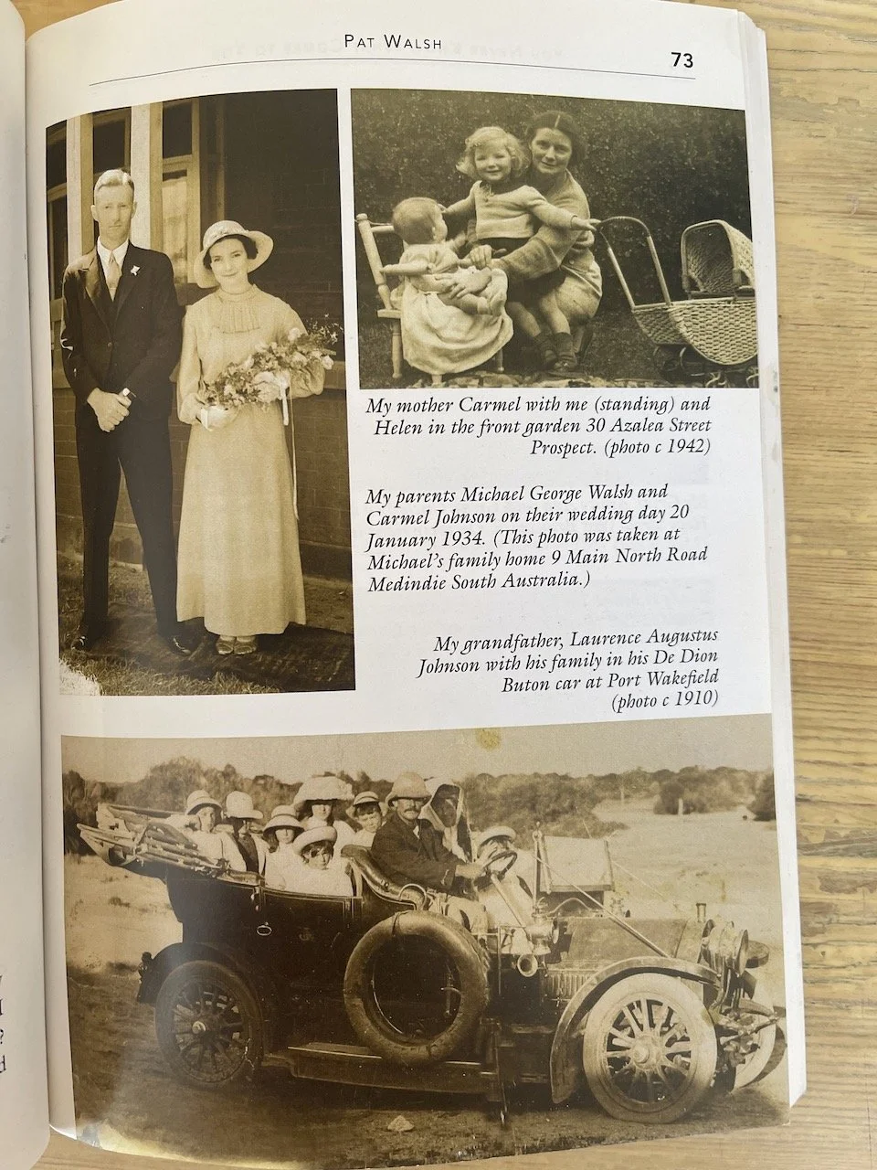
My best birthday present arrived the day mum wheeled a ladies two wheeler bike down our passage - my ticket to freedom had landed and I was off too see the country - Gepps cross! Here the plains began and I saw funny half-tank like shaped buildings sprouting up. Dad told me these were the homes for new Australians. 

-
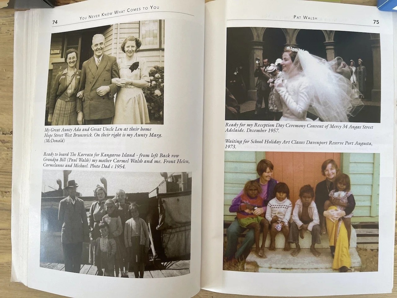
It was the early 1950s when dad built our red brick beach house - perched on a hill in second avenue Moana. Mum proudly named it St Michael’s. 

On the back of our large Moana block dad made a tennis court that gave us lots of room to play. More important than this play area was an even bigger play area that was walking distance from our house - Moana Beach.

Looking back today I cherish the opportunities we had at Moana to roam freely in natures art galleries. Our parents trusted we’d be safe, put a few restraints on us and off we’d go each morning. Our first port of call was Moana Kiosk, (still standing today). Here two shillings bought us two hours of riding the waves on a rubber surf shooter.

-
Back home on Azalea street Prospect, life reverted to our predictable meat and 2 veg routine.

Roasts on Sundays, 

sausages and mashed potatoes on Monday

Crumbed Chops on Tuesday

Tripe with parsley sauce or lambs fry with bacon on Wednesday

Stew or steak and kidney pie on Thursday

Friday was fish and chips or that glaring orange English filet.

Saturday was a make-do day with soup and pasties when the footie was on, and cold camp pie, cooked corn beef, brawn or fritz and salads when the cricket was on. 

-
Going to the walls…


Today I look back. Entering convent life was like I’d divorced my family and life beyond the convent walls. I didn’t have access to a phone, visiting days was once a month and it was as though I was now living in an overseas community.

In spite of this separation I enjoyed the novelty of my new life. 


The novice mistress outlines the daily routine:

“The bell to rise will be at 5:25am and you are to be in the chapel at 5:50am for chanting (in latin).

After this there will be 30 minutes of meditation.

A short break then it was back to our stalls for mass in Latin at 7am.

Mass over in silence we filed to breakfast down a narrow corridor connecting the chapel and cloister to the former Barr Smith house.

Breakfast was taken in silence except on first class days, these were Holy days of obligation, like Christmas and Easter Sunday.

On second class days speaking was permitted from midday. On other days lunch was taken in silence.

Silence was a big part of convent life.


-

It’s now 1972 and I’m back with the trees at Mercedes college, assigned to teach grade four.

I’d already learned about teaching through teaching music for 10 years and now I was to learn about learning.

This Transformative experience was due to a wonderful teacher named Joan McKie.

Joan arrived with firm beliefs about learning and created a stimulating environment where children were free to learn. Under her inspiration the lower primary school was named Murakunji - an aboriginal word said to mean “many little whirlwinds often seen in large numbers”.

Under her creative plan children chose their own area of learning - sometimes they spent all morning, or all day or all week doing their chosen area of learning.

This child directed learning, with support from teachers, astounded me. All around I saw children productive and creative. They were self motivated, engrossed and stimulated with what they were doing.


-

I was doing aboriginal studies as part of my Batchelor of education, and one day finishing an assignment an idea of working with aboriginal children surfaced.

A few weeks later I was summoned to the principal’s office for a long distance call.

Lifting the receiver a deep voice boomed.

“Harold here. Would you be prepared to do a creative activities program with Aboriginal students at Davenport reserve in January?”


I’d heard Port Augusta was a pretty rough place and I wondered what an aboriginal reserve would be like.

-
Our accommodation on our first visit was in one of the white staff houses run by the department of community welfare. This staff house was a refuge after the draining heat when doing art with a bunch of enthusiastic aboriginal children. These kids were not fazed by the heat and came around peering through our window at 7:30am ready for more art. 

-
later in 1974 - my superiors decided to fund two positions at Davenport.

This time Sr Joan and I were to pioneer a new course for adults on Davenport reserve commencing 1975.

I was 35 and full-time work with aboriginal people had called and found me. 

Our classroom to be was bare and without air-conditioning. Our flat had an air conditioner however, and a lounge/kitchen area, bathroom, laundry and one bedroom. Joan and I shared the bedroom. This sleeping arrangement was a hurdle for me as since entering the convent eighteen years earlier I’d always had a cell to myself. This I now realised had been a luxury and now I needed a large chunk of adapting.


Suddenly I was confronted by an aboriginal woman:

“are you government?”

“no” I replied

“are you welfare”

“no” I repeated

she then shouted:

“I WANT A DIVORCE!”

Laughing I bleated out “I’m a teacher.”


Thinking back to those early days at Davernport I’m reminded of a day when I was sitting in the middle of the back seat of a car full of Aboriginal students. For some unknown reason, while we drove along I suddenly blurted out “I’m the only white fella here.”

This resulted in a laughing woman student who was besides me, patting me on the arm saying, “Don’t worry Bub - you’re black on the inside.”


My time at Davenport Pt Augusta was a high point in my life. 

It was a time when barriers began to be pulled down and pushed away. 

A time when the thoughts, ideas and energies of many people came together to create a unique Aboriginal community development program that showed new things were possible. It was a pivotal time in my life. 


-

Today it’s ten years since my leukaemia scare and I’m well. 

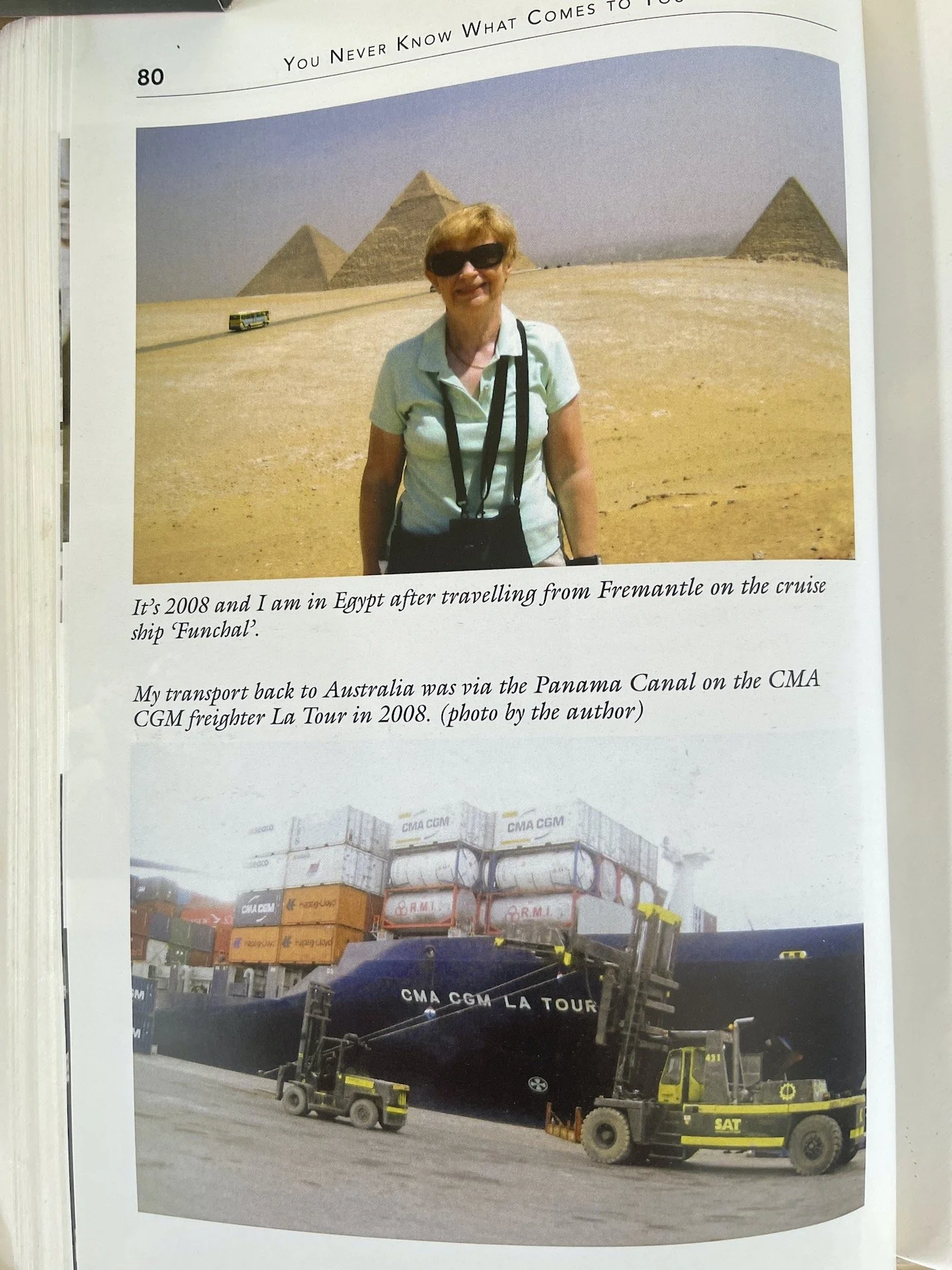
My time of chapels, churches and classrooms has long gone. Most days now I walk along Glenelg beach close to the sea’s edge as I admire nature’s wonders of the sea, sky and sand and man’s inventions as I see planes come and go from Adelaide Airport. I haven’t  been on a flight for a couple of years - but what I have done is fulfil a dream to go around the world without one flight!! 

Yes Aunty Pat did that in 2008, visiting every continent on the way - according to her it was quite an adventure she took a cruise ship from Fremantle through the Suez Canal to Europe - a bus tour of Spain, Portugal and Morocco. And even got a police escort at the port of Dunkirk to board a freighter bound for Australia via the panama canal.


…I can’t believe she did that, and what’s even more astounding is that she did it all by herself. 

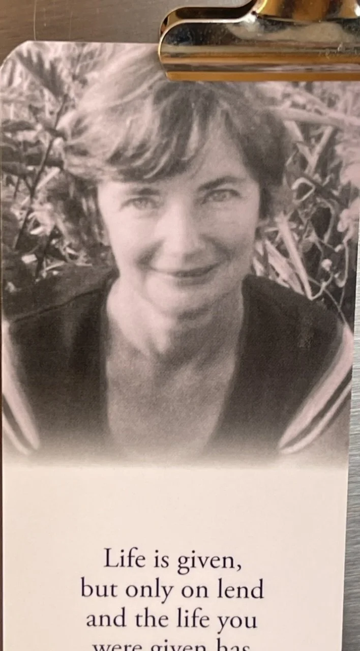
I’ll finish now with the quote found at the start of her memoirs by Margaret Mead. I love this quote and I believe Aunty Pat aspired to be the person this is about:


“If one doesn’t love one part of the earth and every tree and blade of grass on it, how are you going to love the whole world?

You know the planet isn’t very loveable all by itself. 

But if you work up from your neighbourhood and the hills and the trees that you love and your own children and your own religious beliefs and you own language, you can end up loving the whole world.”

I got myself some acrylic paint pens...

…last year and haven’t used them much… well I’ve been using them to write on the back of paintings, and I’ve used them in 3 or 4 studies so far, but only tentatively.

I didn’t want to get too many pens incase I didn’t like them so I bought myself a few pastel colours and white. I figured that I could use normal texta markers, like sharpies, if I wanted to go dark because they do draw over paint, but light coloured textas are transparent and don’t work well over other colours and you can’t actually get white textas or opaque pastels textas. You can get white gel pens though which draw over dark colours, but they are pens with a very fine tip, and they work great over watercolour.

The best thing to do when you get some new materials is to use them - have a play and make a mess with them, learn through trial and error. It’s a bit of a paradox really because once you get them out and the excitement dwindles after a the first try followed by disappointment (nothing works like you think it’s suppose to the first time), and then after the first few tries you don’t want to waste them on just any old mess when you don’t know how to use them masterfully, so they end up sitting there in the kit looking important… and very new.

that was also my experience with the watercolours I bought myself about a year ago - a nice little kit and it’s looking very new…still…

My first instinct is to draw with the paint pens, so I start the the painting with a messy drawing using the pens.


A few days later…

…as things would have it, being school holidays and all, I’m away in the country on holiday, so I can’t finish the paint pen bat or blog in time for my weekly post…unless…

introducing my mostly unused watercolour kit…

I packed a light kit for watercolour en plein air, (I bought it for this very reason a year or so ago) and I tried outdoor painting in watercolour for the first time today. When I bought the supplies a year ago I bought a tiny little, good quality watercolour journal which is so lovely I was not ready to use it for just any old mess, so the next day I got for myself a cheap little journal from office works which I’ve about half filled by now.

I tried to condense my kit as much as possible for outdoor painting, so I can just stop and sketch without too much fussing around.

My first attempts at watercolour in my budget office works journal.

Viridian green...

…is a colour I’ve had in my oil kit from the very beginning, but it’s not a colour that I’ve used much and it’s certainly not a colour that I would normally add to my skin tone pallet…however, I’ve noticed that other artists that I admire do include Viridian green into their complex skin pallets (by complex I mean more than 4 colours + white), and so I think it’s about time that I tried it for myself.

so…

I set out the complex pallet that I said I would try in a previous blog and painted an alla prima portrait right off the bat. I was pleasantly surprised at the addition of viridian green, and I’m itching to use it again.

colours used for this oil painting study are, Viridian green, Ultramarine blue, Cerulean blue, transparent red oxide, Cad red, Cad red deep, Alizarin crimson, yellow ochre, titanium white and ivory black.

note: if you want to watch the process on youtube see here

The trick to using Viridian green in skin tones is to mix it with the reds to get skin colours, so instead of adding blue or black and yellow, you use the green as the main mixing colour into the reds, and then tweak it with the other colours, not the other way around. It’s just works so nicely, like it’s the perfect mix of blue and yellow for this job I think.

I put out so much paint…

…on my pallet there’s enough left to do another portrait, so I’m going to try something else that I’m not really comfortable doing - finishing a portrait that I started in acrylics with oils, and I’m going to use this complex pallet.

I painted this acrylic study…

…earlier this year. I used a limited pallet, 3 colours + white and left it looking unfinished.

It has now been transformed with the oils, and although the process was frustrating (like I prefer to start in oils if I’m going to use them), I’m happy with the results (see below).

oil study over acrylic underpainting using the complex pallet with viridian green.

I have one more idea to try before I close this blog…a limited pallet using viridian green, red and white. I’m dubious that I’ll pull this off without adding yellow ochre to my pallet but we will see…

with the addition of yellow ochre, viridian green and red + white make a workable skin pallet.

well…after these studies I am moving viridian green from the pile of paint that I don’t bother with to my pile of necessary colours and favourites.

Fancy that!


Zinc White...

is a transparent white, which is kind of weird because white is not a colour normally used like other transparent colours are used….technically white is not a colour and is used to tint other colours when mixed with them. Zinc white has one tenth of the tinting strength that titanium white does.

so how should it be used…

…time for a bit of play, and as i’m writing this I’m thinking of a way in which I can experiment with zinc white.

My first experiment was a bit of a fail - trying to use zinc white like I normally would use white, mixing it with three primary colours to paint an eye - I ended up getting frustrated and having to add white gesso to add enough strength to the paint for the light tones because the zinc white is so subtle that it’s almost like using a water colour. (there is no watercolour white paint, btw, as the white paint that you get in watercolour sets is actually paint not watercolour. I gave up before I finished.

Then I thought I’d compare zinc with titanium as mixes and on a dark ground.

zinc study 1

the way I paint, zinc white is too transparent to be the only white to use on skin. The thin nature of the zinc pigment is more obvious when painted over another colour.

zinc study 2

comparing zinc with titanium white, mixing them both with red and then seeing how it looks on a dark ground

now I need to think of another experiment…

….also I’m writing this blog as I try the experiments, which is an experiment in itself too :) I feel like a bit of a scientist.

I’ll try it on a bit of fruit…and maybe another eye…

Zinc study 3

It feels moody on a dark background (or is that me ‘cause I’m struggling). A softer brush lays the paint down better than a corse one. It works nicely with layers - light over light to bring it up to lighter tones. I like how you can see the light layers which you normally don’t when using opaque paint unless you add medium. It’s kind of like using a tinted medium really. None of this is really surprising except that it’s white doing these things - like it’s just not how I’ve ever used white before but I see the potential…

Just from these little experiments I understand zinc white alot better. It will be useful when I want gentle shifts of tone at the end stages of an acrylic painting rather than battling with getting the colour match using titanium, or thinning it with lots of medium. It would also be good for opening up dark colours like blue without obviously tinting them, I think.

Zinc study 4

Here I'm comparing the tinting strength of titanium white to zinc white in midnight blue paint. I really notice a lovely effect happening around the mid tones, the zinc makes a cleaner colour that doesn’t look as pastel as it would when adding titanium white, and it’s so much easier to make subtle changes of tone.

The best thing I can do to really get a feel for it and see if I like it is to simply put it on my pallet along with titanium when I’m painting and see how I go, and if I do this for a few months it may become a necessary part of my painting process. We shall see.

note: all experiments were done in acrylic paint.

What should I paint next?

…is a question that I sometimes ask because there’s a million things I could, and want to paint next, and it’s hard to decide. In fact, the choice is so overwhelming that the question is always about making a choice rather than coming up with a new and innovative idea.

Interestingly, it’s not much of a problem if I get an answer that I don’t like because the painting process is the fun part and it’s just a matter of making the subject fit the process.

It’s lovely to paint things that mean something to you as these make memories - painting things like gifts, flowers that people give you, vases that belonged to your grand parents, portraits of people that you know, pets, fruit off of your dad’s tree, the cup of tea you forgot to drink, a lovely pear with the leaf still attached that you’ll eat after, a corner of the lounge room, the view from the bedroom window, your own hand, a poem that you wrote (painted conceptually that is), the letterbox or something out of the garden, a bunch of lavender in a hand thrown ceramic pot you got for your 21st from an old friend.

What would happen if I asked “How should I paint my next painting?”

hmmmm….

I guess the “how” bit is about skill and mastery of materials, to use them in different ways to create the required effect, or to use materials that I don’t use alot, like oil pastels and watercolours, or paint something super smooth with no visible brush marks…that seems to me that it could be a bit more difficult to fulfil.

Paint things that people give you

I got a bunch of proteas from the lovely Mareka and so I painted one.

Paint things to create memories of them

Pat got this little succulent for her 16th birthday from her friend.

there are rules...

…in painting that make the process more enjoyable when observed - like starting with the dark tones and slowly introducing the lighter tones as the painting progresses. In oil painting this rule is a good rule to follow, but this rule doesn’t really apply to acrylic painting because of the fast drying nature of acrylic paint.

It’s absolutely fine (as far as i’m concerned) to start an acrylic painting with the lightest value and work all over from the value scale as randomly as possible.

Oils on the other hand…

I hadn’t touched my oils for a while so I thought I’d do a couple of studies using similar limited pallets to the acrylic studies I’ve been doing of late, (3 colour studies with a mid tone being my darkest tone) and I found myself introducing the light tones early on in the painting process, right at the start, breaking the rule of dark tones to light… I kind of went… mid tone…light…mid…light…(“help I need to add an extra dark option”, added 1 more colour to my pallet - raw umber in this case)… dark…detail.

Cad yellow was used in both studies, with permanent rose and manganese blue hue in one of them, and cad red and cerulean blue in the other. At the very end of each painting I needed a dark tweak - burnt umber to the first and prussian blue to the second - three colours per painting + white + a tweak, and I blame the overpowering nature of the cad yellow for needing this tweak. Both paintings were alla prima - they were painted from start to finish in one sitting, not allowing the paint to dry in-between stages.

The next oil study I’m going to do I will try a classic complex pallet.

This will be something like:

Viridian green, Alizarin Crimson, Transparent red oxide, burnt sienna, Cad red deep, Cad red light, yellow ochre, titanium white, cerulean blue, ultramarine blue and ivory black. (I googled it)

Note the yellow in the above example of a classic pallet, there’s just the one which is not a strong yellow at all, and the next closest thing to yellow in this pallet is the green which is pretty dark.

I plan to post the study with the classic pallet next week…

stay tuned.

oil studies,

1/ daughter in Cad yellow, Permanent Rose, Manganese Blue Hue + white + Burnt Umber

2/ study in Cad Yellow, Cad Red, Cerulean blue, + white + Prussian Blue

see my struggle with the limited oil pallet on youtube:

the struggles are real…

Indian Yellow...

…has been around for-like-ever, but is a colour that I’ve only recently started using myself.

Even though I put it in the “dirty yellow” box along with yellow ochre, Naples yellow and raw sienna, Indian yellow is clean and bright by comparison and this is because it’s transparent. I guess it’s in the dirty yellow pile because it has an orange/brown quality to it.

Indian yellow was first used in 15th century India. It was made from the urine of cows fed on mango leaves which contain a toxin called urushiol. The cows became very unhealthy with this diet but their urine produced the precious pigment which was dried to a powder and the powder was formed into balls of yellow pigment which was shipped around the world while it’s source remained a mystery. No one knew what it was made from until 1880something.

It was around the time of the discovery of how the yellow was made (Sir Joseph Hooker’s work), that the pigment disappeared off the market…something about animal cruelty…there’s not much of a record about this except his letter of enquiry to the Indian Department of Revenue and Agriculture.

Luckily for me, and every other artist who loves the colour and loves cows, Indian yellow is now a synthetic replication of the original pigment.

The thing I love about Indian yellow is how it mixes with other colours. It’s not a yellow I would use without mixing it with some other colour - like I’ve tried it as a colour by itself in a background and it doesn’t work for me on it’s own, it’s not beautiful on it’s own but boy oh boy does it mix well with other colours. It makes gorgeous oranges when mixed with reds and pinks, it makes wonderful greens when mixed with blue and other greens and that’s why I love it so much.

playing around with Indian yellow

Indian yellow study of daughter no. 2


art study...

…is playing around with different concepts, ideas and materials in preparation for something larger.

It’s play really, well…the kind of art-studying I’ve been doing this last week feels, to me, like play.

I must be learning something… I’m trying things that I haven’t tried before, but it seems more like I’m confirming things that I assume will happen because I’ve kind-of done something sort-of-like-it before, or I’ve seen something maybe done in a similar way somewhere, but haven’t put it to the test for myself.

Every study is somewhat different from the one preceding it, but similar enough to guarantee some degree of success, and success is enjoyable - so there’s the repetition and the pleasure of knowing there will likely be success and that is what makes it more like play, I think.

“Play is the work of children” - so I figure that in order to make it age appropriate work I’ll sum it all up with the writing of this weekly blog which feels more like work than the art studies do, but is more like play than the art studies are.

One thing I’ve learnt from writing these blogs is to save what I write as I go. There’s no pleasure at all in accidentally deleting a well thought out paragraph or two because you didn’t have the foresight to save them before the phone rings and you close the page in a multitasking fluster… …and my “ iCloud storage” has been “full” for at least 5 years.

Art studies are suppose to solve problems in preparation for the finished work.

One thing I’ve learnt from problem solving with art studies is that I need some problems to solve…

…and that got me thinking…

…maybe it’s the creating of new and interesting problems, and not just the solving of them, that makes art study different than play.