White paint...

…makes grey paint when you mix it with various browns. You don’t need black to make grey.
White paint lightens colours to make pastels, it can also intensify the colour when used sparingly but when used liberally it desaturates the colour. It makes colours dull as it lightens them - so what should be brighter tones will loose vibrancy and appear dull as the opaque pigment replaces colour with tint to make lighter but less brighter tones.

It’s a bit of a paradox using white.

The most common whites are opaque.
Antique white is warm and creamy, I use that as well as titanium which is cooler and usually pretty strong because it’s opaque, and unbleached titanium (which is kind of beige), not really white, but certainly light.

There’s zinc white which I believe is meant to be transparent, I have a tube in oils but I haven’t studied it yet. Apparently it’s good for keeping colours vibrant when lightening them because of its cool transparency. I’ll do a study on zinc white soon out of curiosity. (Mental note…I’ll write it in my diary later).

There’s led white too which is warm, opaque and extremely toxic. Titanium has replaced led as the most used white because of its toxicity. I’ve never used led white myself, probably never will even though it was the favourite white of many great painting masters and is meant to be lovely…

White is a colour in nature but in paint it’s the absence of colour meaning you can’t mix the colour white, rather the paint is made without adding colour but taking it away (think unbleached titanium).

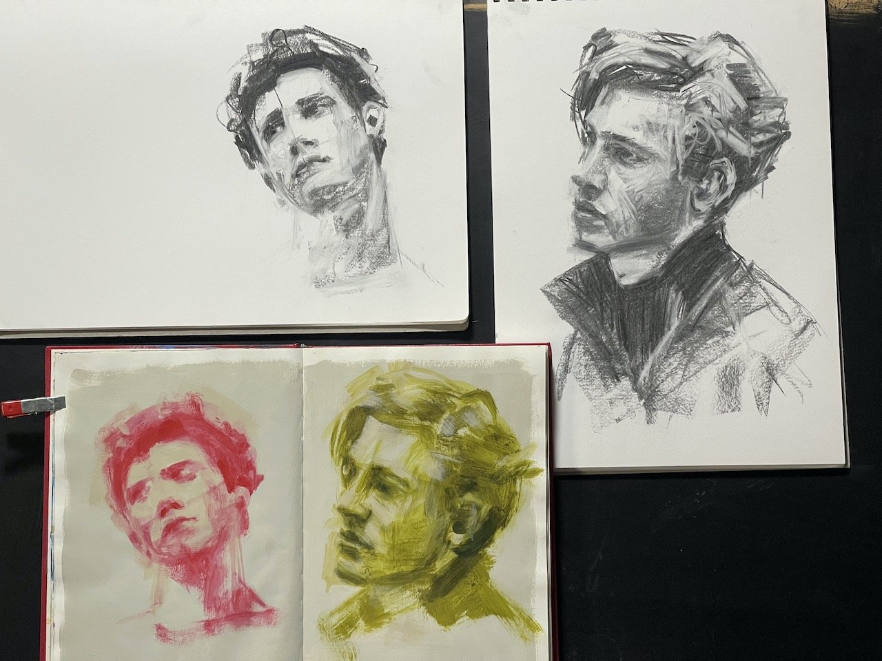
So the rule of thumb in painting is to use white sparingly…unless, ofcourse, you want to use it liberally to make the work all about white, which is what I’ve attempted to do with this pot and blog.

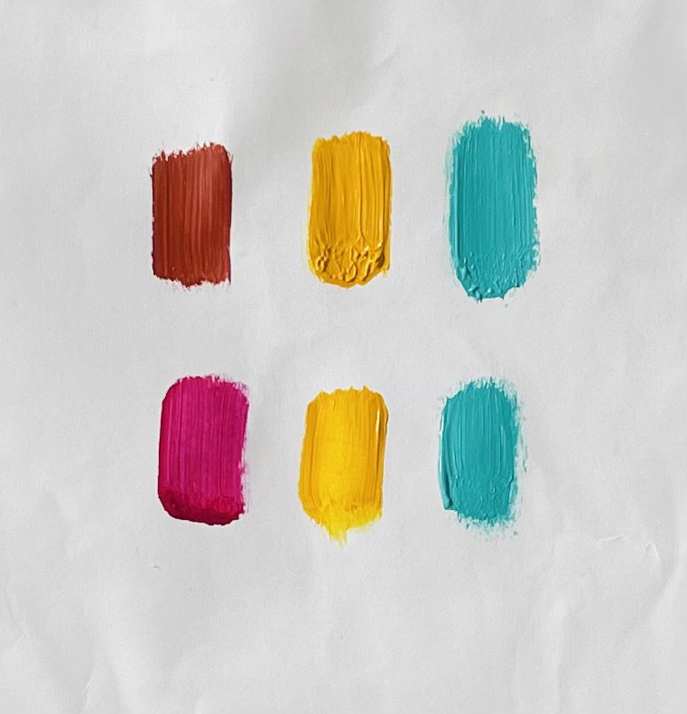
colour pallet using Indian yellow, magenta pink and Prussian blue, + lots of white

What should I paint next?..

I have a list about a mile long of things I want to paint and of things I need to paint that will bring me up to speed with requests, commissions and various projects I’ve expressed interest in. They are all exciting and I want to attend to them all at once. It is impossible to do them all at once, of course.

To resolve this fortunate problem I allocate time for the work that I need to do, and for the work that I want to do, during the days that I paint (most days).

I’ve talked about my commission work in a previous blog - I set time aside early in the morning for that…usually before breakfast. I’m working on a commission right now in-between writing these sentences for this blog. It’s a nearly finished little animal portrait, and to complete it I am doing a series of little touchups and corrective tweaks, and after each set of these thoughtful brush marks I turn away from the painting, write a sentence here then turn back to it with “fresh eyes”, and this helps me from over working the painting and losing some of the spontaneity of the first marks of paint…(that’s what I tell myself, anyway)…

You see it takes time to finish paintings…time spent thinking about it not actually painting it, and sometimes this can feel like procrastinating…(come to think of it maybe that’s exactly what it is), so it’s helpful to have some other simple tasks to do in-between each set of tweaks, like housework, checking emails, bookwork, blogging…starting a new painting….except the problem with starting a new painting is that you can get so caught up in it that before you know it you’ve got two paintings that need finishing…or three…or twenty paintings that need finishing.

It’s important to finish paintings - by finish I mean as finished as they can possibly be kind-of-finished. That means signed, dated, ready to hang, photographed and shipped kind-of-finished.

For me it works best to spend time finishing paintings in the mornings, a hour minimum each morning so that I can feel like I’ve worked productively, done what i’m suppose to do and then be free to explore or start something new later in the day, something fun, or a thing I’m curious about or have been meaning to try, or a study or a request…

…which may very well end up on the morning pile, needing to be finished.

My youngest was…

…presented a little jar of flowers after the opening night of her first Fringe Festival performance, she’s in the circus, so I thought I’d paint them while they still looked fresh.

Art Study...

The thought occurred to me the other day - what am I actually studying when draw or paint some random heads found on the internet? Am I studying the heads, the paint, or the process?

At first I thought I was studying heads but it doesn’t really matter who’s head I’m painting when I do these little studies because I’m looking for an arrangement of light and shadow that’s interesting, dramatic and exciting.

I never wonder “who are these people?” I never wonder what their lives are like…it’s hard to put context into the found heads without making up stories, and I’m not making up stories about them in these studies.

not really…

One head came with a name - a name written under the head - Celine. I’ve drawn Celine at least 5 times.

It’s very different when I paint people with context though - be that people I know or people I’ve been asked to paint, celebrities or even a self portrait. Context changes the work from a study to a painting, and I think this is because now I have a story to tell.

paintings are visual stories

so…

I suppose what I’m really studying when I select random heads off the internet is the process and the materials.


Celine

Know thy colours…

A good way to understand a particular colour is to mix it with other colours and with white. Mixing a colour with other colours shows its strengths and weaknesses. A transparent colour does different things when mixed with another colour than what a similar opaque version of it does, as does a cool or warm version of the same colour, like different kinds of red.

Mixing a colour with white opens up the colour so you can see it more clearly. Dark colours, like midnight blue, Paynes grey and Dioxazine purple can all look the same when they are in little piles on your pallet, but a little bit of white mixed into each colour immediately shows how different they are from each other.

Below are two examples of almost the same colour pallet, but I’ve used a different red.

In the first painting (pear) I’ve used light red ochre which is opaque, Aqua green light which is opaque and pastel, transparent Indian yellow and white.

In the second painting I changed the red ochre to transparent Magenta and the other colours are the same.

light Red Ochre vs Transparent Magenta

the earthy colour of the red ochre is warm and brownish compared to the vibrant cool, transparent magenta, and the green is pastel which didn’t allow me to mix a strong dark so I needed to adjust all my other tones to create the illusion of a strong dark.

Acrylic paint…

…has it’s advantages and disadvantages.

I totally love how quickly it dries, that you can wash brushes out in water and that it doesn’t smell as strongly as oil based paints.
The quick drying factor means that you can put down a layer of paint and 10 minutes later you can put another layer of paint on top of the dry paint. Laying wet paint over dry paint like this is my favourite way to paint.
The most annoying disadvantage of acrylic paint is that on a warm day the paint literally starts drying on your brush before you finish laying it off on your painting. It dries on the pallet too before you’ve finished using it, so you need to clean and refresh your pallet several times during a painting session or you get frustrated with the drying lumps of paint that look wet but won’t move when you try to stick your brush in it. It then becomes a hunt for the tiny bits of paint that are still wet enough to paint with. This is most frustrating at the end of a session when you might have one or two tiny corrections to do which requires a minuscule bit of paint but there’s just dried paint on the pallet so you have to put out your colours again and mix the tiniest bit of colour up to match the part you want to correct which leads to…
…the other most annoying disadvantage of acrylic paint is that acrylic paint dries darker, so it’s very difficult to colour match for corrections. This is because the acrylic resin in the paint is opaque and white when wet but dries clear…and correcting with the wrong colour or tone is like opening up a can of worms…

Study in acrylics on a hot day.

Commissioned Paintings…

…is part of the work that I do and presents it’s own set of challenges, the biggest of those being time.

The weirdest thing about painting commissions is that if I don’t have a set deadline for the commissioned work to be finished by it’s much more difficult to complete within a reasonable time frame. It’s also more difficult to get started.

Without a deadline a painting that should take me 3 weeks can take me more than a year.
It’s not necessarily that I take more time actually painting it, but I take more time thinking about what to do to start it - what materials to use? what colours? composition?…what process to start with?
After I’ve made some choices that set the stage for the work and I actually start painting it, I’ll spend more time than necessary between painting sessions looking at it and thinking about what to do next…as I’m doing that I‘ll procrastinate and start working on other things, clean the studio…go shopping…do some cooking…play around with new painting ideas…make a YouTube video…etc…there’s no hurry so there’s plenty of time to think about the commission…and think…and…think…


When there is a deadline, what I do to get things done on time is I set up my paints in the evenings, then I get up very early the following morning and do an hour before breakfast. I set the timer and work the full hour without interruption while I drink my morning pot of plunger coffee. The whole process is very enjoyable and when the hour is up, I feel a sense of accomplishment that affords me some extra time to explore ideas, later in the morning, that aren’t so urgent…which might even be another commission that doesn’t have a deadline.


commissioned paintings - see here

Honey Inside, 30x30cm

If I write a blog about…

…my latest YouTube video about my RedBubble store and then post it on my Facebook page, I’m killing 4 birds with 1 stone…of course I could always add the original painting the video is about to my Bluethumb shop and make it 5 birds, share the lot to Twitter (6 birds) and Instagram (7 birds)…(9 birds if I include my alt Leonardo Bogato accounts)…or not even share this to there but just include the links to those accounts here (see below), or sneak a link in the text - see here and here

I’m feeling pretty social media savvy right now…😎

So…now that I’ve worked all of this social media bird-killing-magic out, I can go back to painting birds instead of trying to kill them. 😊

Note: “Definition of 'to kill two birds with one stone' - If you say that doing something will kill two birds with one stone, you mean that it will enable you to achieve two things that you want to achieve, rather than just one.”
sincerely,
Cat.

Another one of the locals , A4 painting on board.

Leonardo Bogato - my seconD…

RedBubble store is up and running. I opened this so I could put some of my artwork that looks out of place in my original store together for sale as prints on products, and doing this I’ve created a niche. “Niche down” it’s called in marketing speak.
What I’ve learnt from doing this is interesting:

It takes a bit of work to build a searchable presence for a new store like this, which is why I’ve titled this blog “Leonardo Bogato”.
Titling this blog, making it public and sharing it on social media makes it (the name) searchable on google. You see merely opening a store in a big site like RedBubble is never searchable, even if you know exactly the name and title of a product and have uploaded many products in your store it’s not searchable that way on google. So I myself can’t even find my own store via google knowing all the keywords. In fact, I couldn’t find my own store from the outside at all untill I put a link to it on social media and entered it through that link - so I can only find my own store by entering it through a direct link to it that I put there myself, or by logging in to it as the owner of it, there’s no other way that I, or anyone else, could happen across my RedBubble store by chance, that’s impossible. So it’s up to me to lay a trail of links in content that’s searchable on google, interesting enough for someone to be curious about and presented in a way that keywords are hit with searches for something roughly along the lines of what the person using google is searching for, and competing with millions of other people’s content using the same keywords for completely unrelated content.

Environmental missile proposal - conceptual art blueprint bath mat.

Print on demand...

…is an order fulfillment method where items are printed on various products, like tshirts snd mugs, as soon as an order is made by the customer. POD is a way for artists to generate passive income from their work, investing only their time (no monetary outlay required), in setting up and maintaining their store.
I spent the best part of the last few days working on my redbubble store, culling and tweaking some of my already uploaded work to fit the new products, and adding a few more works. I really like the look of some of the printed wall art options, and I checked a few reviews to see what buyers had to say about them, most are favourable.
Different tutorials about setting up shop tell different things about how to use e-commerce print-on-demand stores - some say “have a select few designs and products so you don’t overwhelm customers” while others say “have a lot of designs use all of the products and upload everyday to encourage traffic to the store.”
I guess I’ll go with something in between 😊 🥳